MatchPoint
My Role
Lead Product Designer
Timeline
Aug - Dec 2021, 4 months
Tools Used
Adobe XD
InVision
Miro
Overview
Despite tennis increasing in popularity, there still lacks an effective digital solution tailored to the needs of the players.
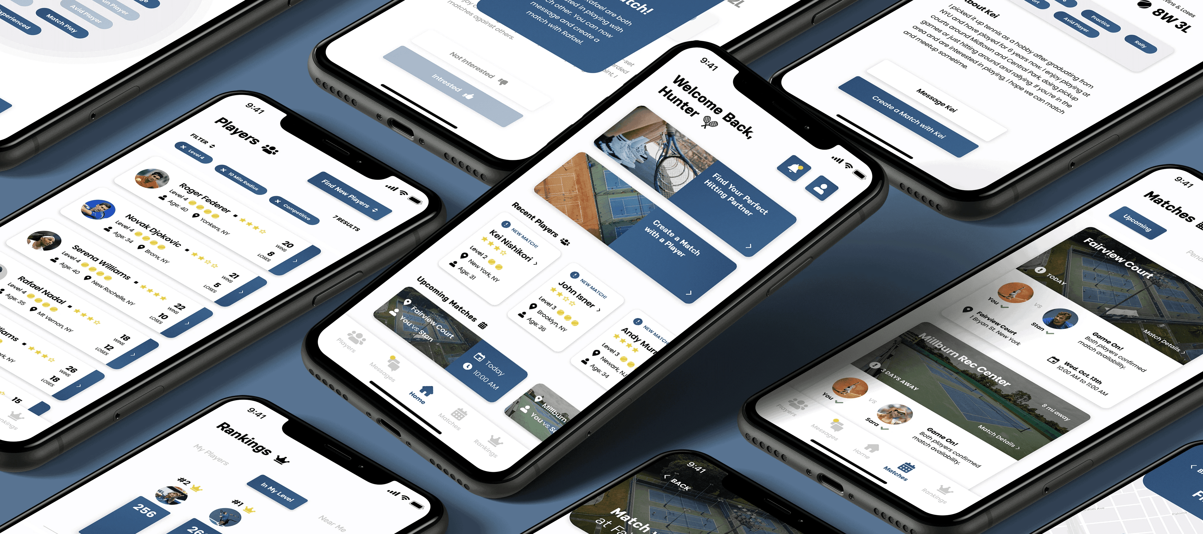
For my Senior Thesis, I created a mobile prototype that allows tennis players of all skill levels to connect with similar players nearby and engage in rewarding match play experiences.
Step 1 of 6 – Research
Identifying Current Issues
What is the problem?
As a tennis player myself, I know finding similar players to hit with and scheduling matches can be a challenge.
Current methods of getting valuable playing time, such as lessons and clinics, can be expensive and involve commitment. Additionally, meetup services and online groups often fail to provide players with a seamless, successful connection experience.
How can we create a seamless, engaging experience that makes tennis more connected for all enthusiasts?
Current pain points
One of the first steps in my process involved conducting a competitive analysis of current tennis player-finding platforms. I noticed two consistent themes of unmet user needs.
Finding 1: Simplicity
People want to find similar players, but platforms are oversaturated as they incorporate social media feeds, coaches, leagues, and more.
Finding 2: Accountability
People are encountering fake accounts and no-shows on the court, leading to a lack of accountability and engagement.
Current users
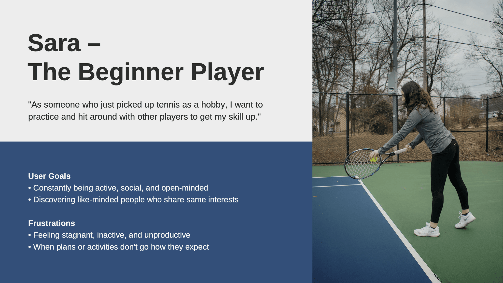
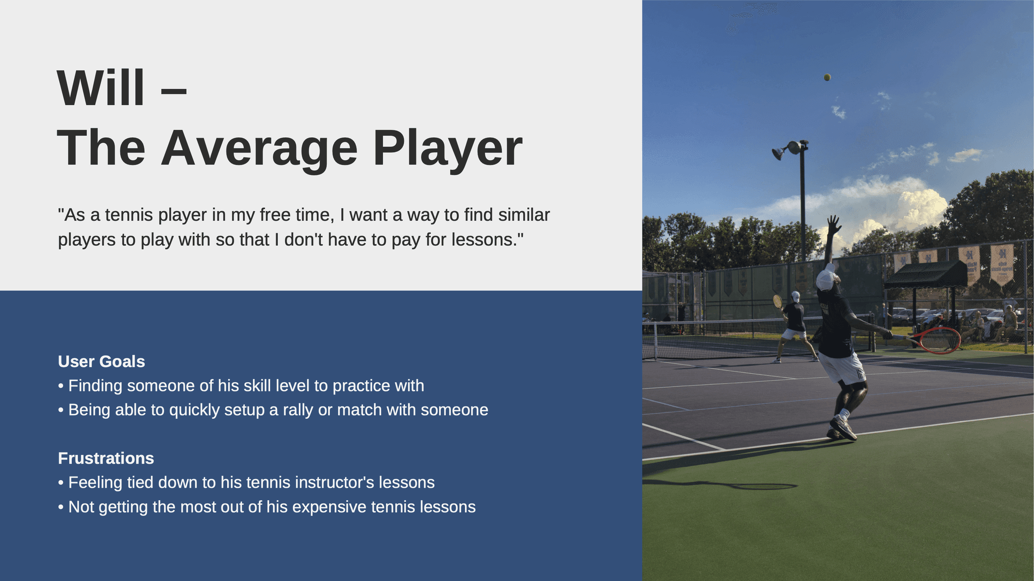
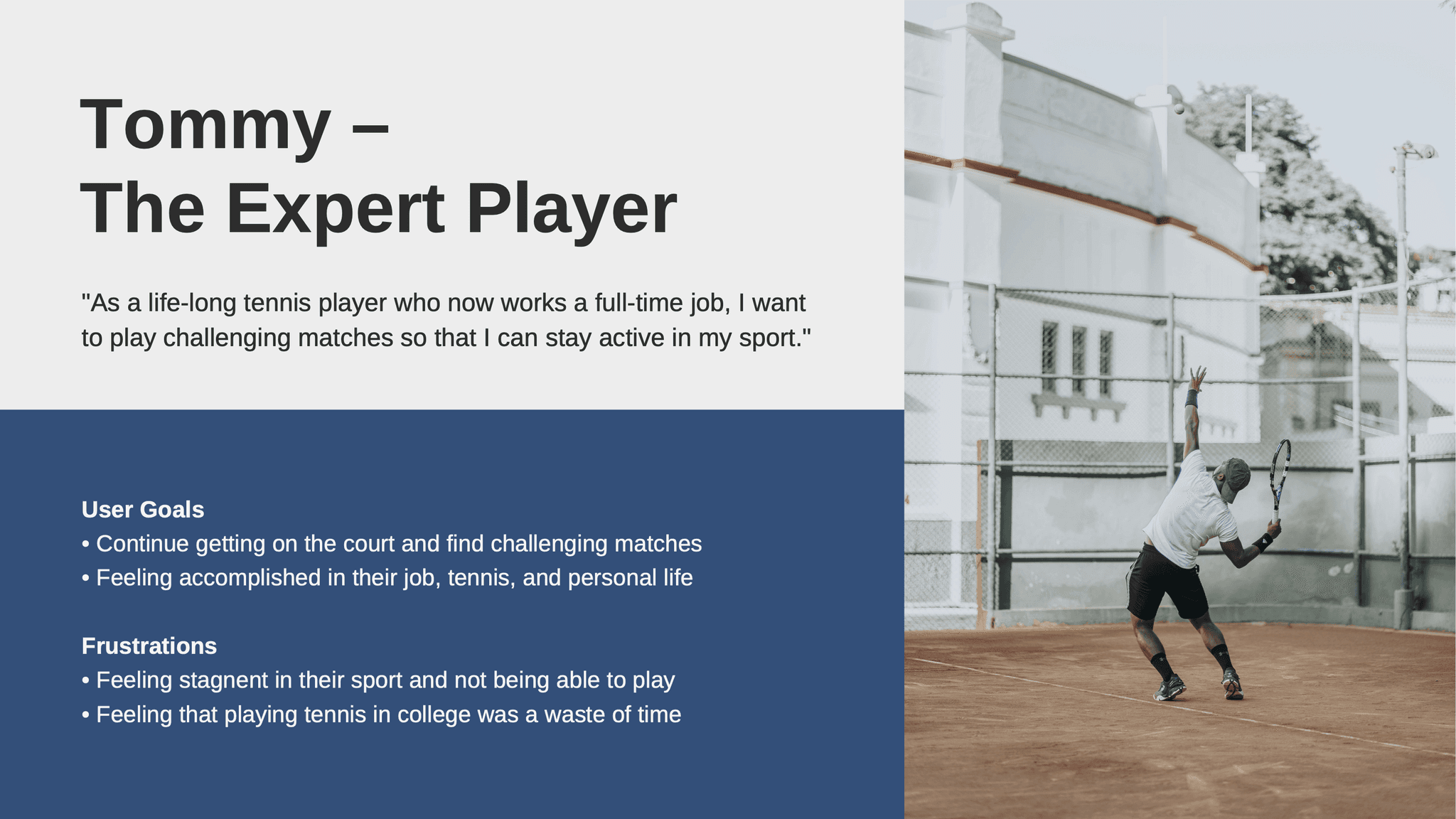
A primary focus was ensuring MatchPoint meets the needs of all tennis players. I researched and developed three different user personas to highlight their tennis experience, goals, and frustrations.
User Personas
Step 2 of 6 – Conceptualization
Brainstorming Features
How might we…
Based on my research, I came up with the following to center my feature proposals around:
How might we address pain points and gaps in the market, such as accountability, abandonment, and engagement?
1. Pre-Match Confirmation
Players are required to confirm availability before a match – unconfirmed matches are automatically cancelled.
2. Post-Match Results
Players can submit their match results to increase in-app score – this is optional for those who want non-competitive play.
Feature Proposals
How might we…
In addition, my feature proposals centered around solving the following:
How might we add value to the user's player-discovery experience while keeping features minimal?
1. Nearby Players
Users can discover tennis players nearby and tap on a profile to send a match request.
2. Nearby Matches
Users can join matches created by players nearby, and create their own match.
Feature Proposals
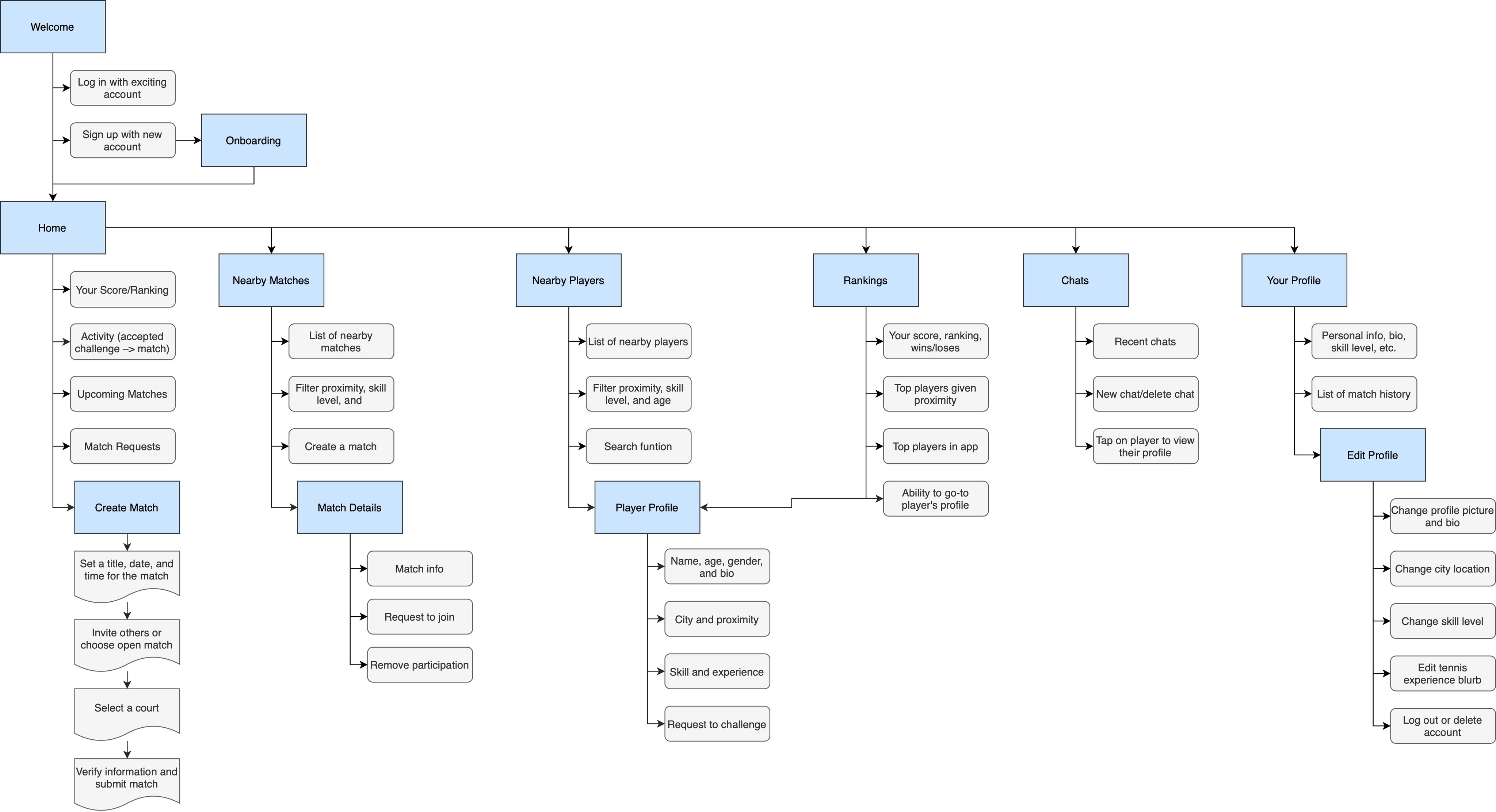
Information architecture
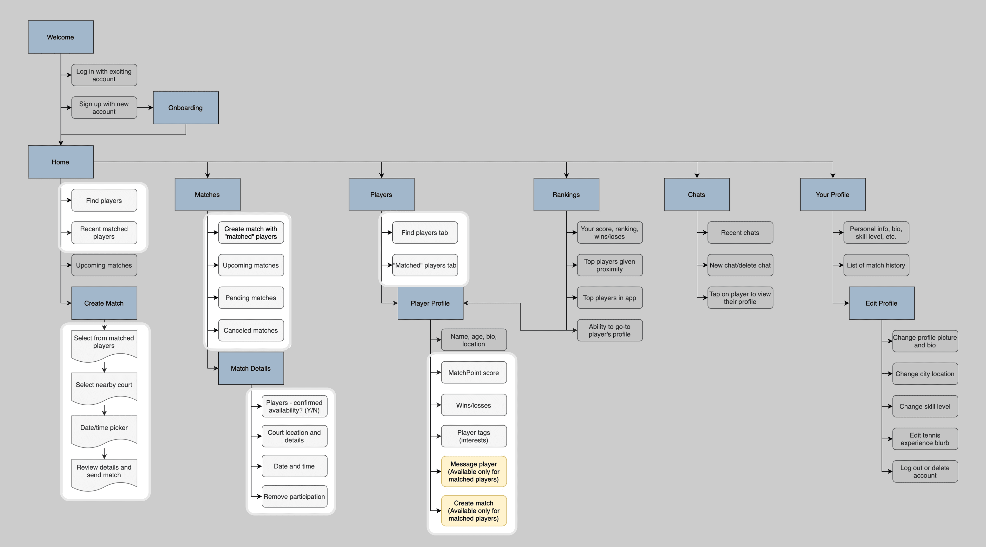
Drawing from my research findings, I put these feature proposals together and defined essential screens to address both market opportunities and user needs.
Information Architecture
Step 3 of 6 – User Survey
Surveying Tennis Players
Let's test it out
I wanted to get feedback on my concept so far before I get locked into design solutions that wouldn't be user-centered.
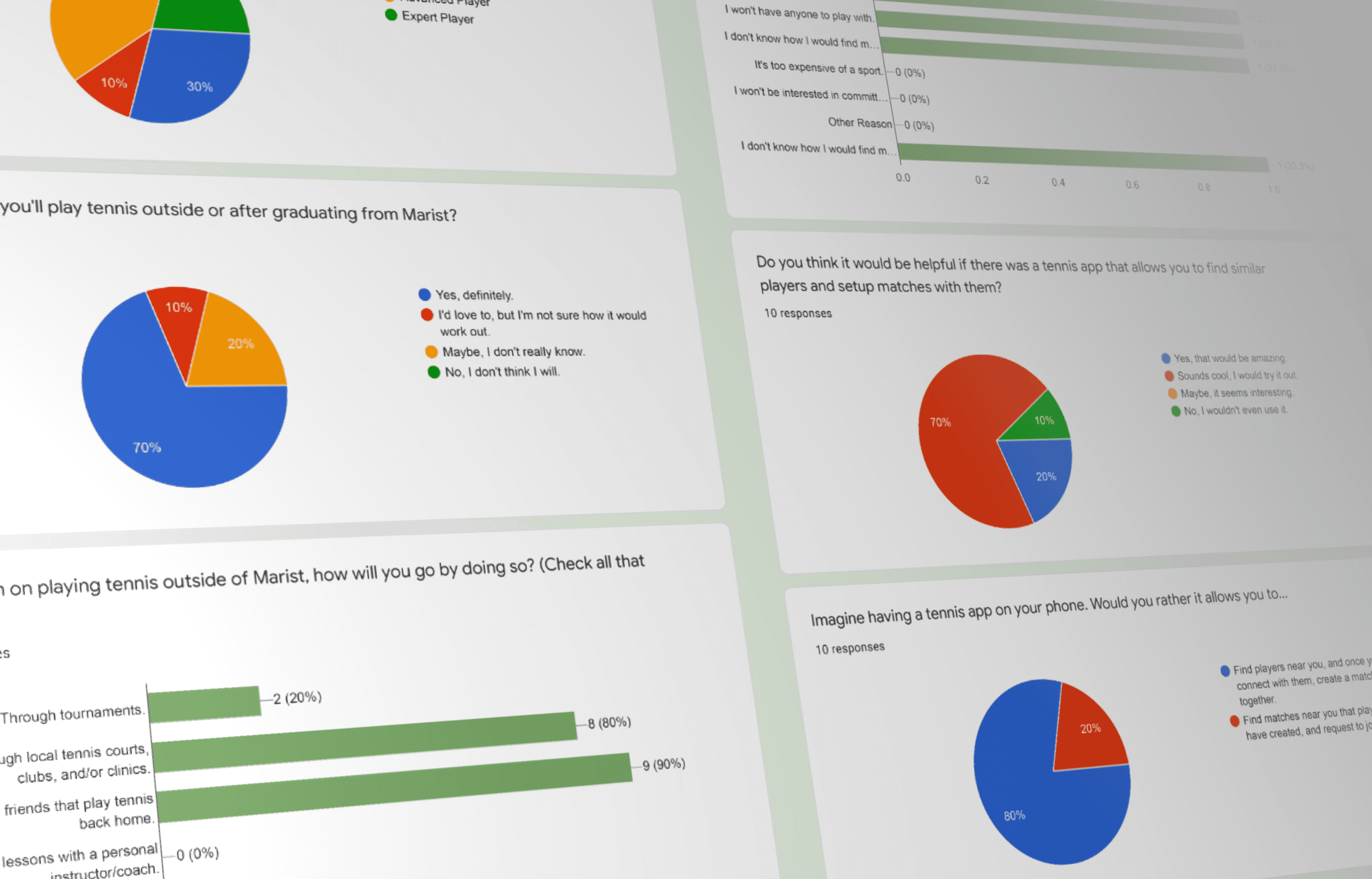
I conducted a survey among the Marist College tennis team to gather feedback about their tennis background, match play preferences, and if a player-finding app would be useful.
User Survey
80% of tennis players prefer to connect with others rather than joining matches that players create.
One crucial discovery
Initially, users would be able to discover both players and matches nearby. However, 8 out of 10 tennis players preferred connecting directly with specific players to arrange games.
Collaborating with my professor, we pivoted from match creation to prioritizing player-to-player connections. We replaced the match-finding feature with an "Interested" or "Not Interested" option on profiles, allowing players to discover others first, then setup a match after mutual interest.
Nearby Matches
Users can join matches created by players nearby, and create their own match.
'Match' with Players
If both players are interested in playing with each other, they're matched and can then create a match.
Step 4 of 6 – Low-Fidelity
Putting It All Together
Design Goals:
Create a form of accountability to prevent no-shows and cancelations.
Design profiles with detailed skill level, experience, and interests to help players size-up others.
Ensure a seamless experience from matching with a player, setting up a match, and arriving on the court.
Starting in-low fidelity
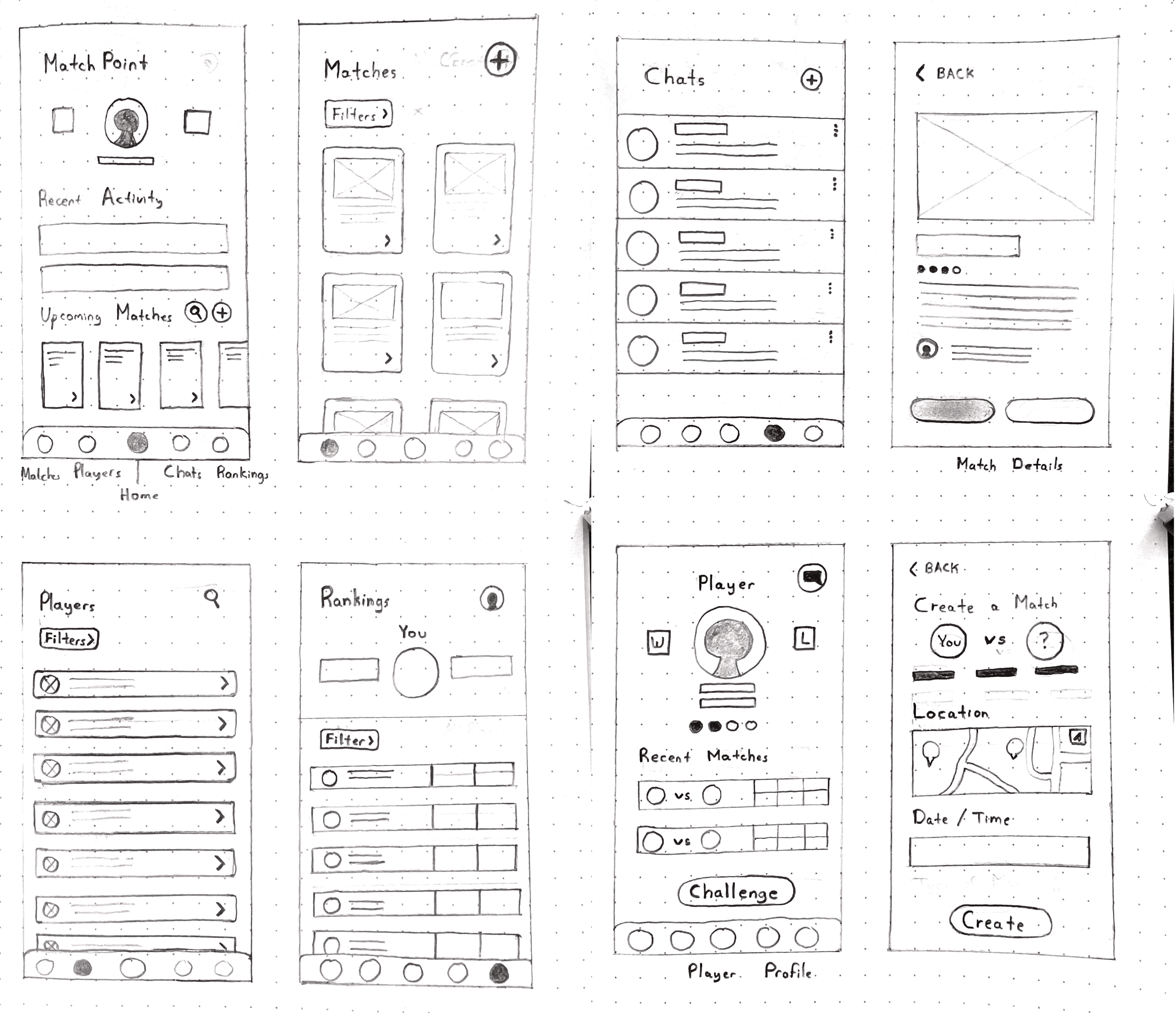
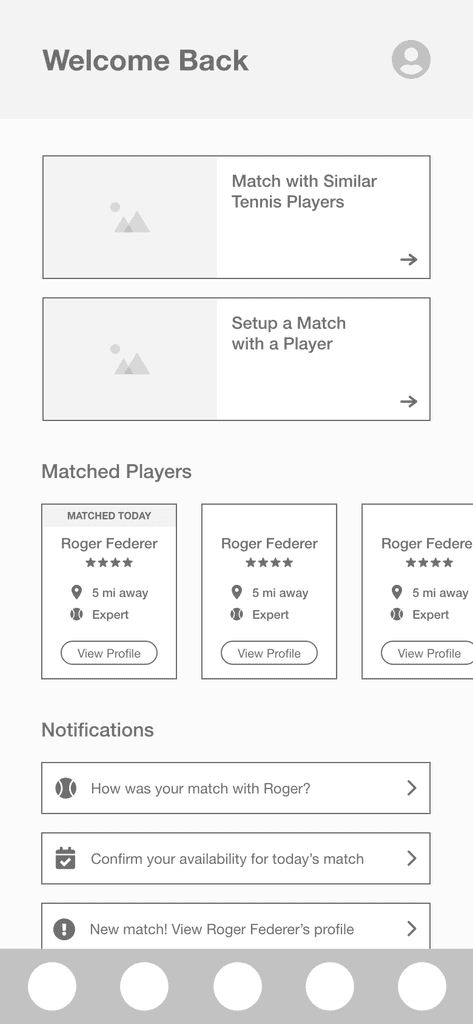
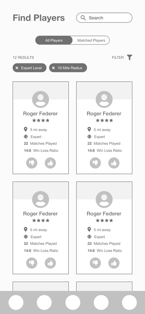
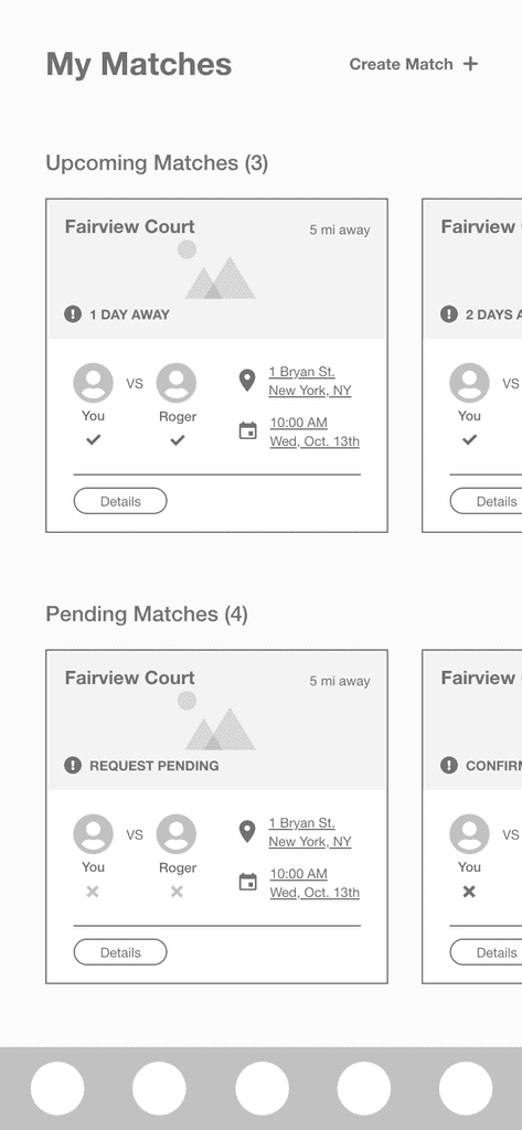
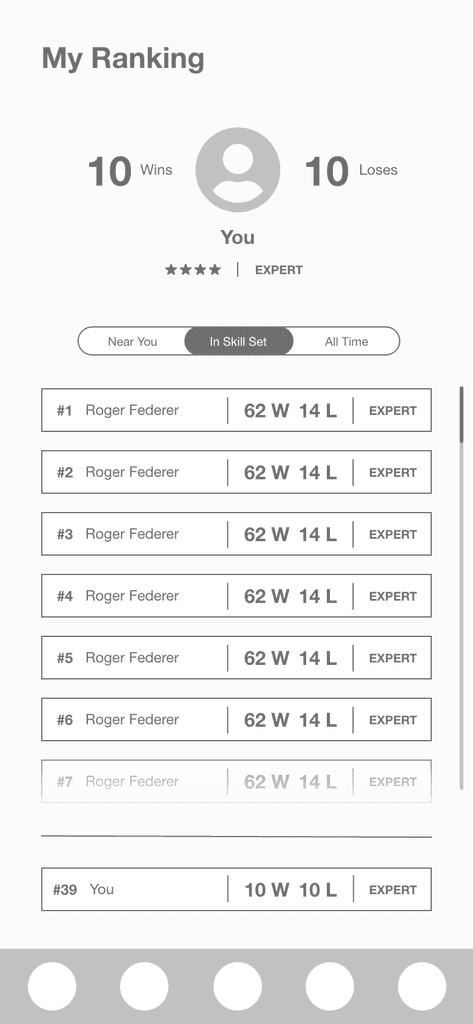
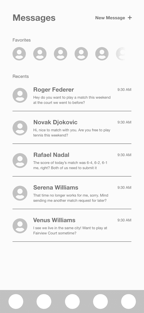
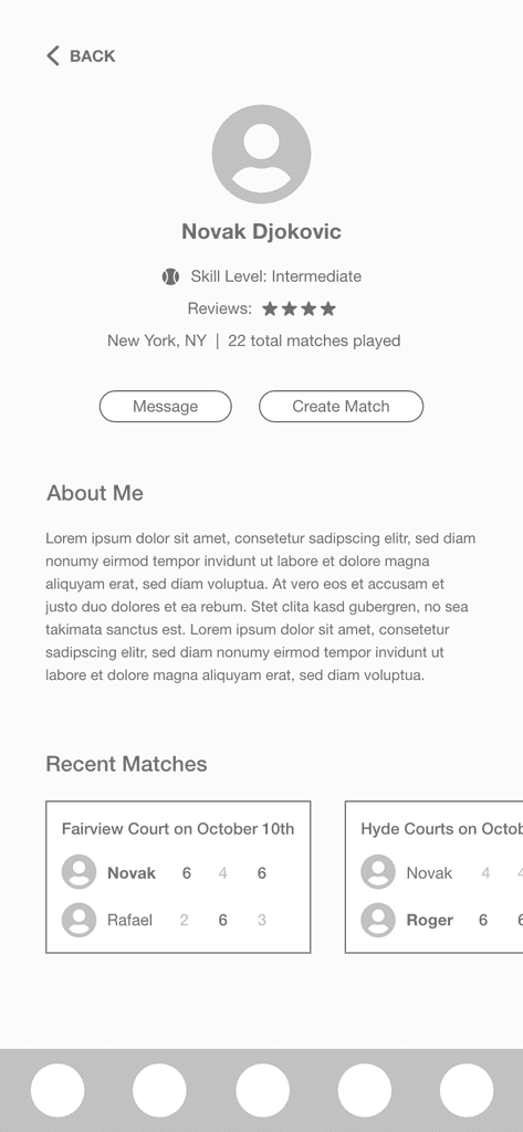
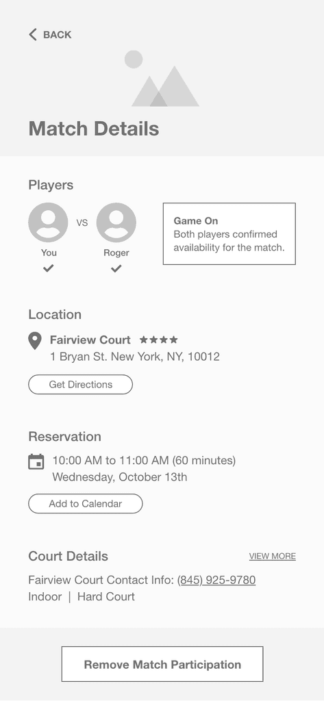
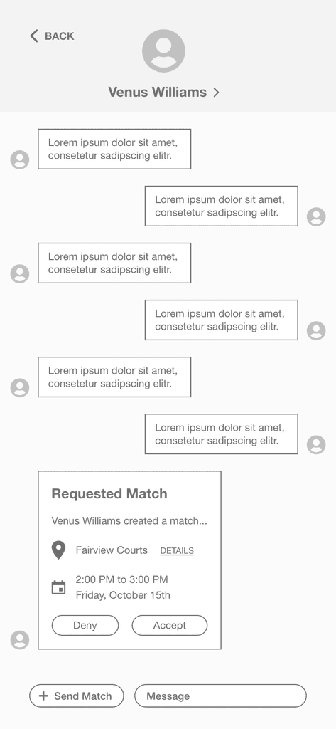
I began sketching out the design to visualize potential layout options. I translated these sketches into low-fidelity wireframes in Figma, incorporating final features and functionalities.
Concept Sketches
Low-Fidelity Wireframes
Step 5 of 6 – High-Fidelity
Establishing the Final Design
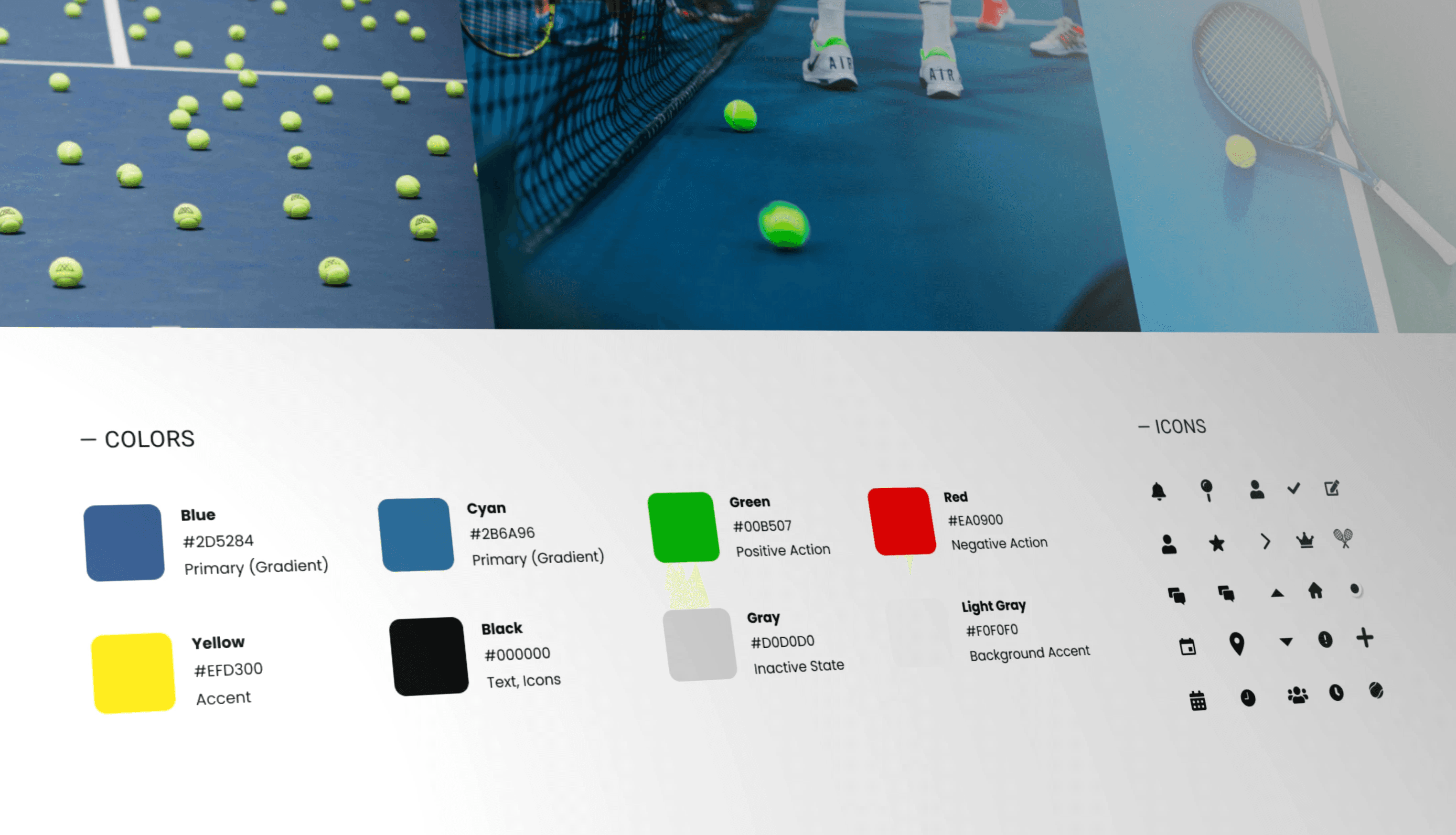
Design Styleguide
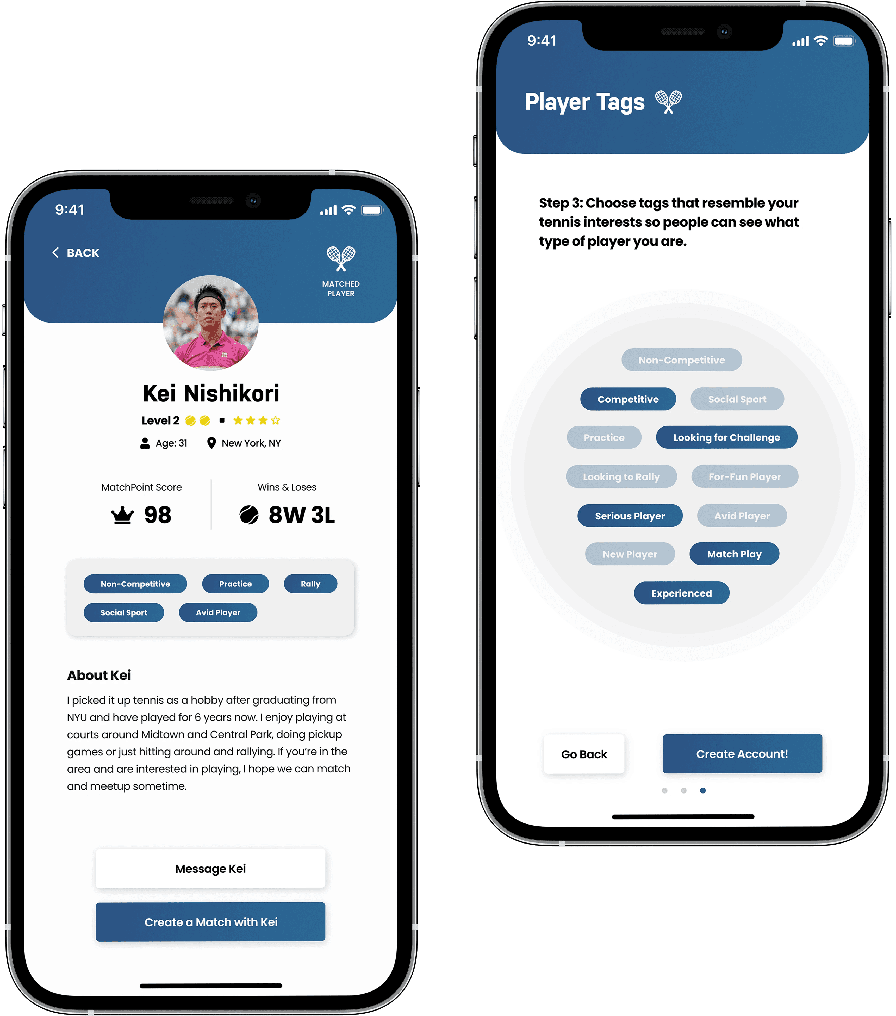
1. Sizing-Up Players
Essential Information
Including useful information such as skill level, score, and wins/losses.
Player Tags
Users can choose profile tags such as 'Serious Player' or 'Looking to Rally'.
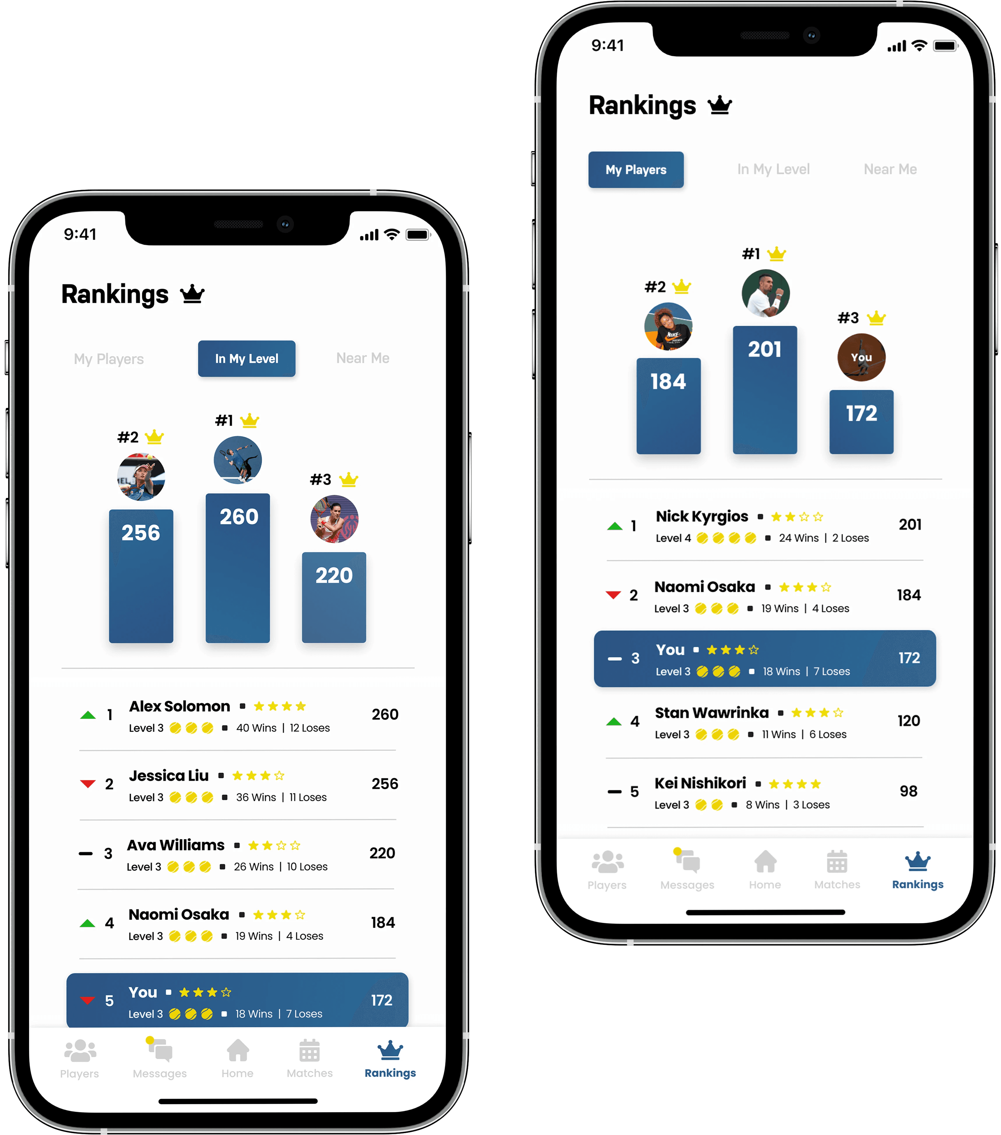
2. Engagement & Competition
Friendly Competition
Users can accumulate points by participating in matches and submitting scores.
Completely Optional
Entering match results is optional for competition only when users want to participate.
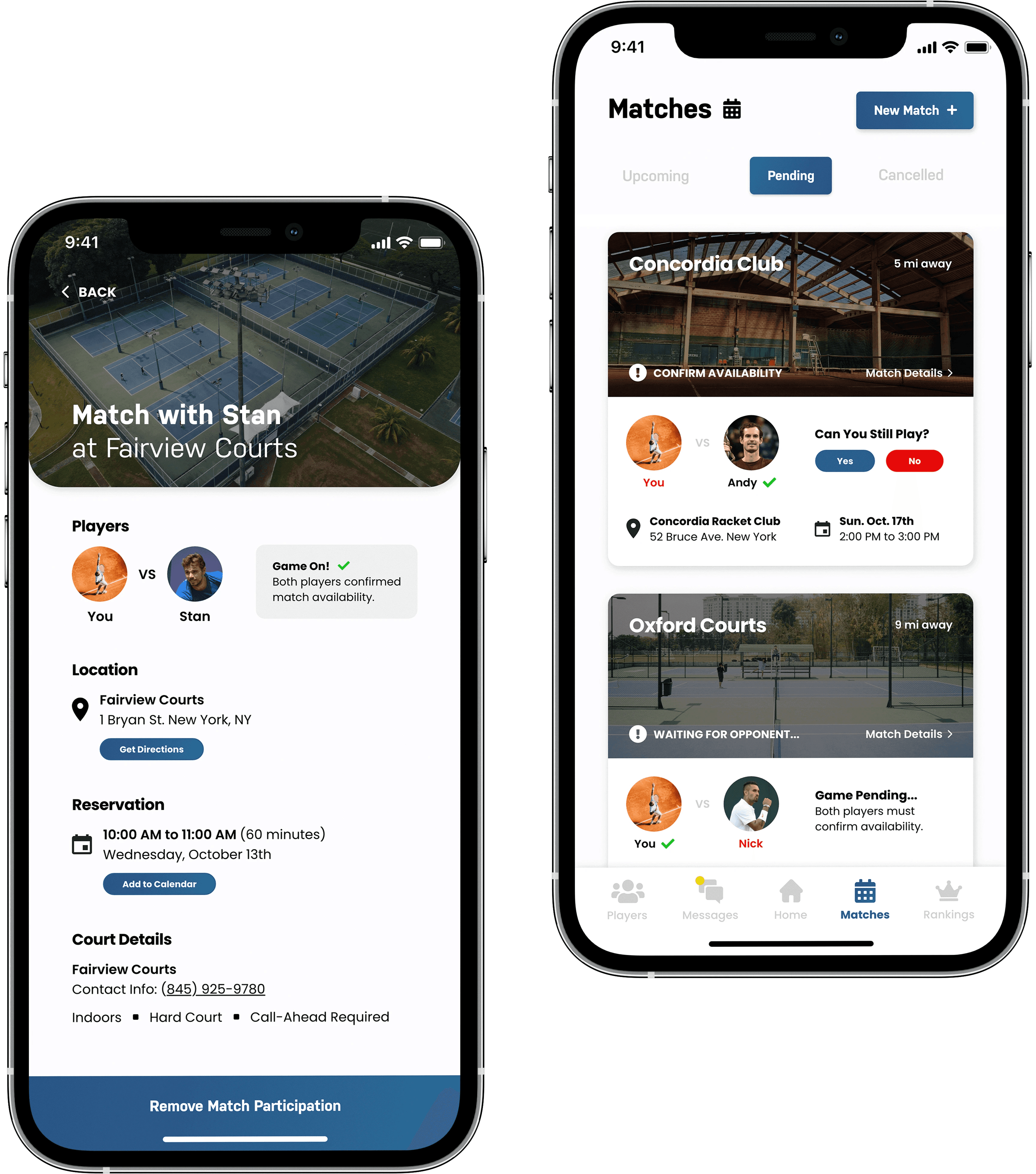
3. Addressing Accountability
Player Confirmation
Each player is required to confirm their availability before an upcoming match.
Hard Requirement
If one or both players don't confirm, the match is automatically cancelled beforehand.
Step 6 of 6 – Deliverable
Wrapping Up
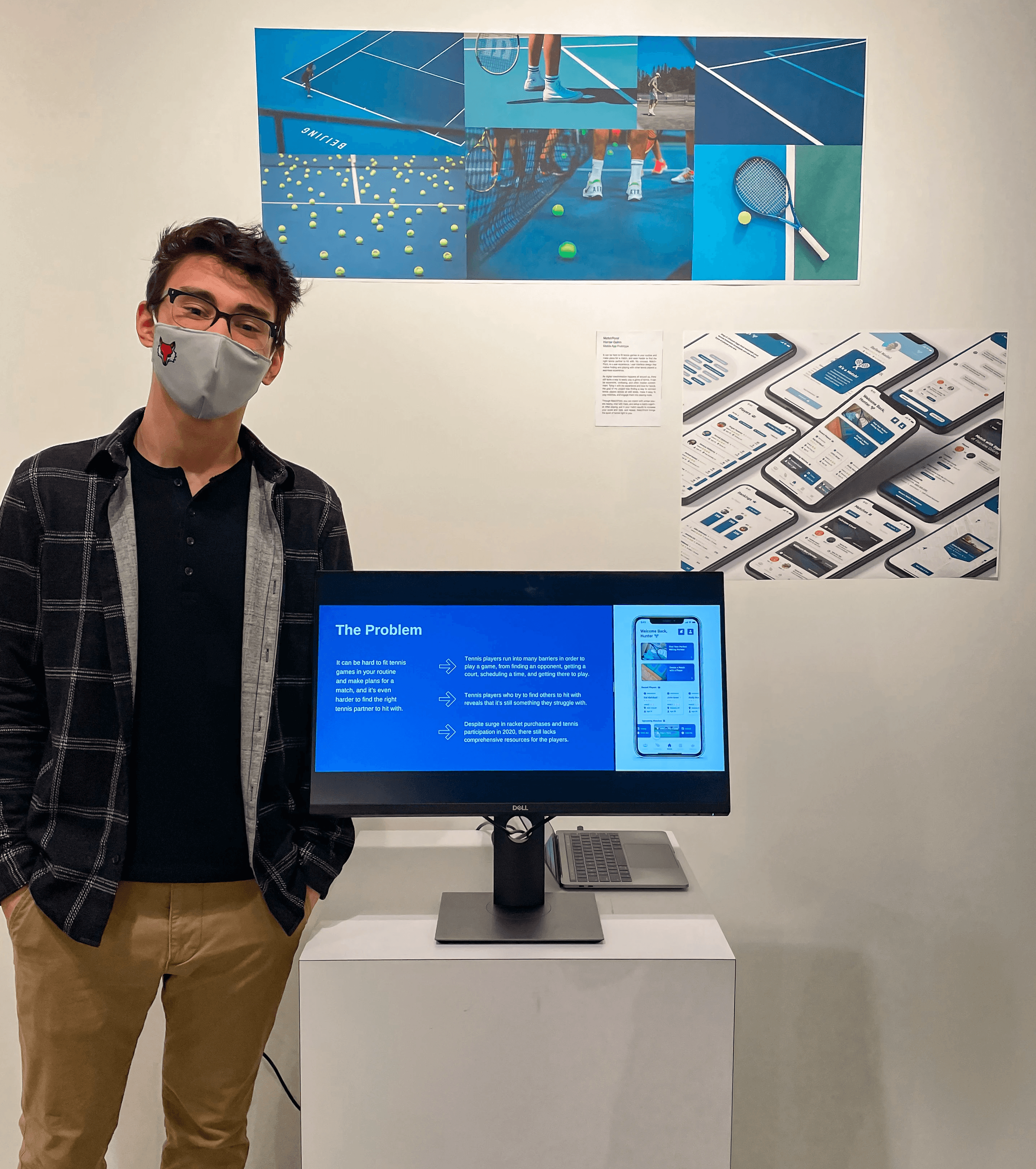
Thesis Presentation:
At the end of the semester, I had the privilege of presenting my project at the Senior Thesis Exhibition, where I showcased my case study alongside my high-fidelity prototype.
Throughout the project, I encountered several challenges, which taught me the value of real-world feedback and importance of flexibility when changing directions.
Project Takeaways:
User-Centered Foundation
Understanding pain points and current market gaps first allowed for a user-centered design process.
Collaborative Problem-Solving
Engaging with my professor and tennis players ensured the final solution was grounded in real-world needs.
