AIP Publishing
My Role
UX Designer
Team
Lead Web Developer
Product Managers
Marketing Director
Timeline
Jun - Aug 2021, 3 months
Tools Used
Figma

Balsamiq
Overview
As part of a company R&D project, I led the redesign of AIP's search website that hosts academic research, articles, and journals in physics.
I played a critical role in identifying user's pain points, scoping the project, and proposing design solutions to stakeholders in technology.
Step 1 of 5 – Project Kickoff
Identifying Current Issues
How are users behaving?
Starting off, I asked myself initial questions – Who are our users? How do they use the website? What frustrations do they run into?
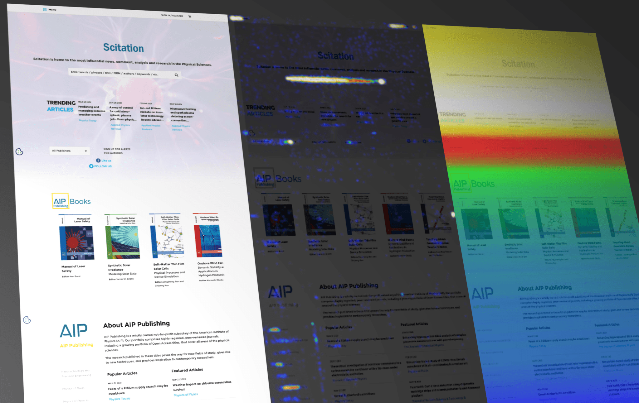
I used Crazy Egg to extract data from 18,000 users on the current landing page. These heatmaps show user interactions, with warmer colors representing higher engagement.
1. Heavy Reliance on Search
Most users only click on the search bar, resulting in other resources not being utilized.
2. Visitor Abandonment
Most users leave once they scroll, suggesting a need to make content easier to understand and use.
Landing Page Heatmaps
Visitors abandon the website quickly, missing out on valuable resources beyond the search bar.
Project Goals:
Increase Engagement
Redesign access to resources to enhance usability, mitigate drop-off rates, and encourage deeper exploration.
Prioritize Current Users
Maintain the prominence of search functionality while enhancing other resources.
Design Efficiently
Refresh the visual design, improve page organization, and reduce scroll length to help users find information quicker.
Step 2 of 5 – User Research
Understanding User Goals
What are our pain points?
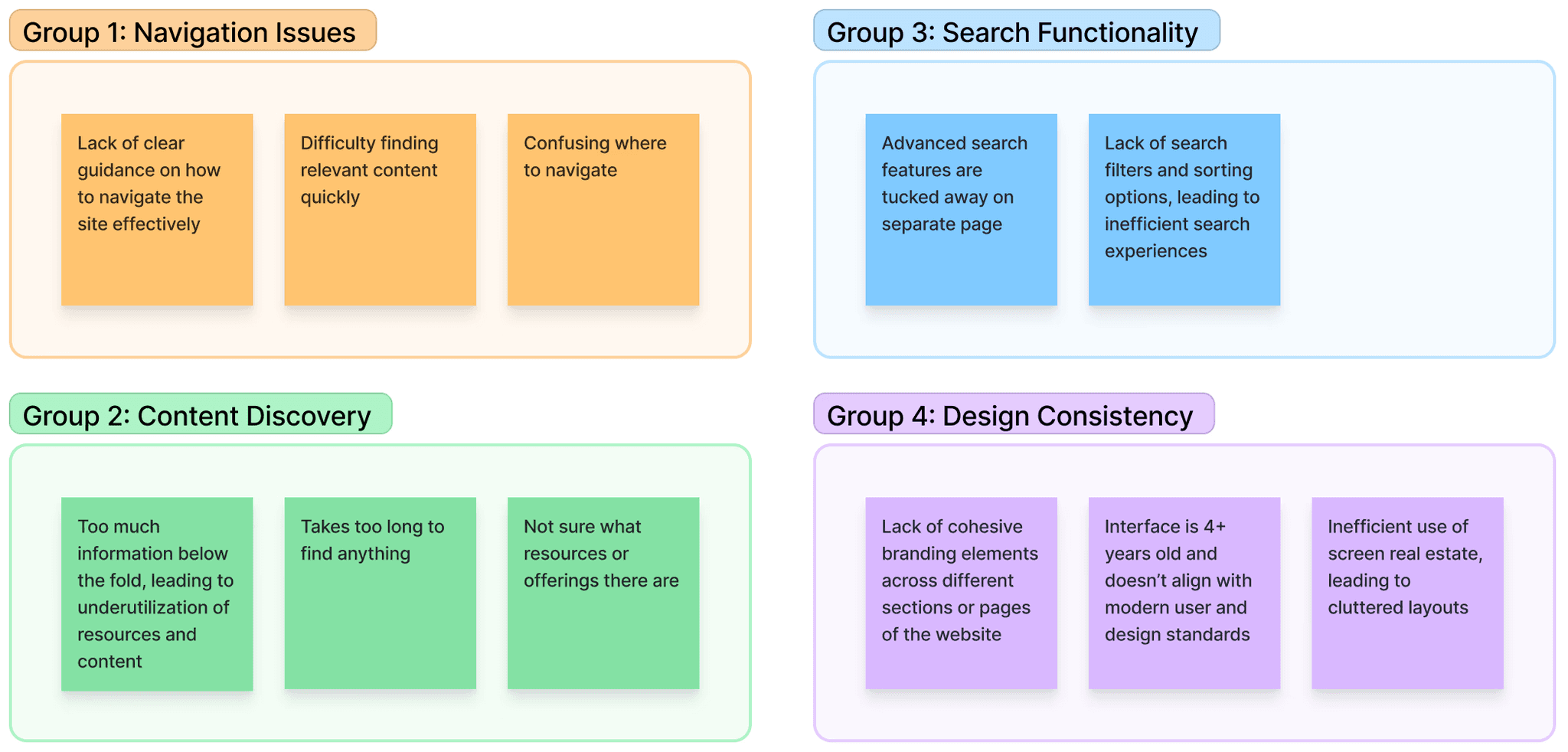
Next, I collaborated with the product and marketing team to create an affinity map, grouping user's pain points into key categories.
This highlighted redesign opportunities and acted as a guide in my design process.
Affinity Map
Who are our users?
My next objective was to better understand who our users are and what goals they have on the homepage.
I translated a role chart from the technology team into two user personas and flow charts to ensure the redesign would address goals of key users.

Anika
"As a physics professor, I want to quickly discover the latest textbooks and articles in physics to enhance my curriculum and support my students' learning."
Motivations
Provide high-quality, relevant resources to students to enhance their learning experience.
Utilize Scitation's reputable and comprehensive database for accurate and reliable information.
Pain Points
Overwhelmed by site's vast amount of content, making it difficult to find relevant textbooks and articles.
The site doesn’t look like other modern sites, leading to a frustrating experience.
User Persona 1

Josh
"As a master's student in Applied Physics, I want to find peer-reviewed articles, literature reviews, and research data for my thesis."
Motivations
Access to a wide range of peer-reviewed articles to support his thesis research.
Utilize advanced search features to efficiently find highly specific research papers.
Pain Points
The site's structure is not intuitive, leading to wasted time trying to find certain resources.
Lack of search filtering options makes it hard to sift through large volumes of information.
User Persona 2
Step 3 of 5 – A/B Testing
Testing Redesign Ideas
Low-fidelity iterations
Next, I ventured to see what competitors in the industry are doing and how they structure search features, content, and resources.
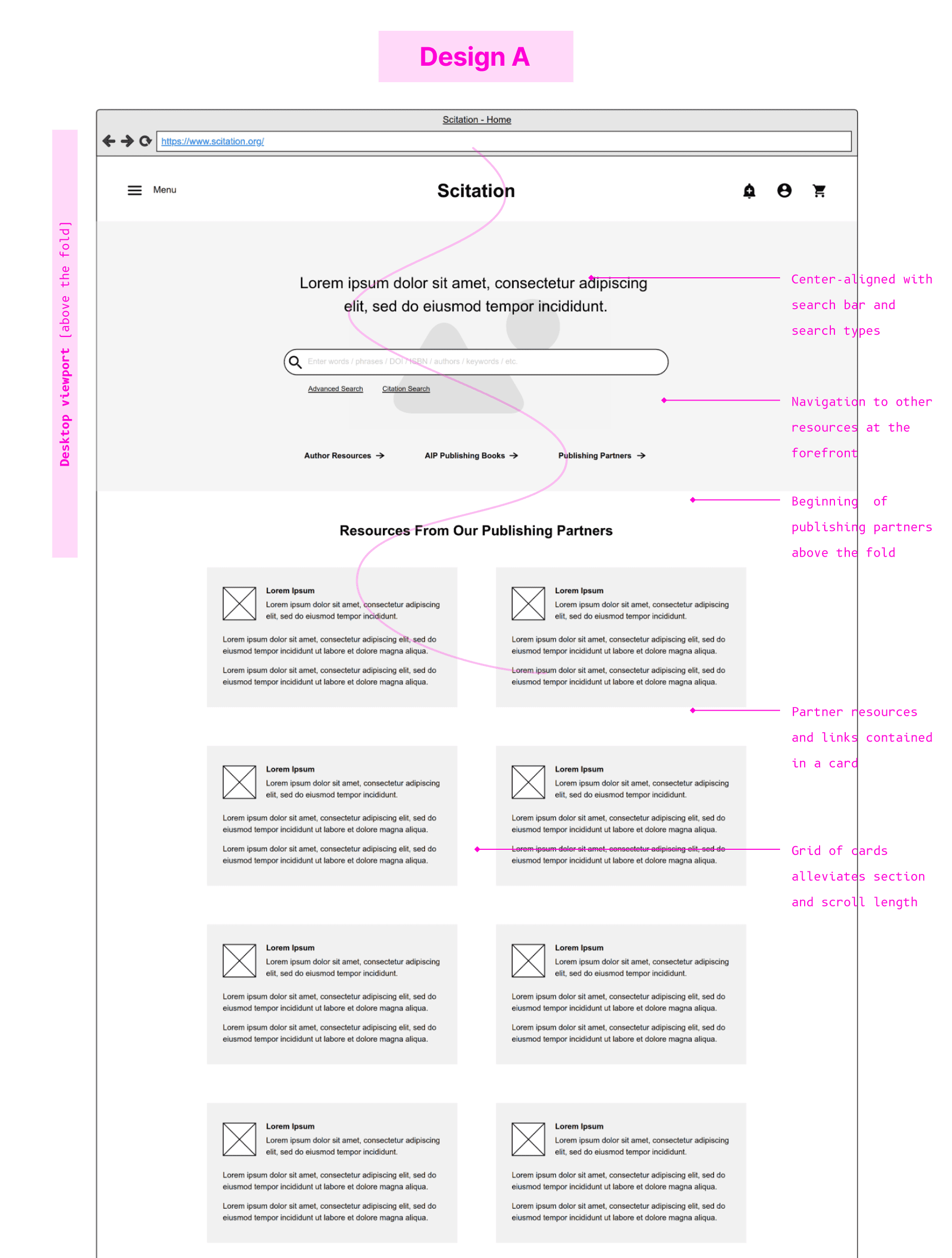
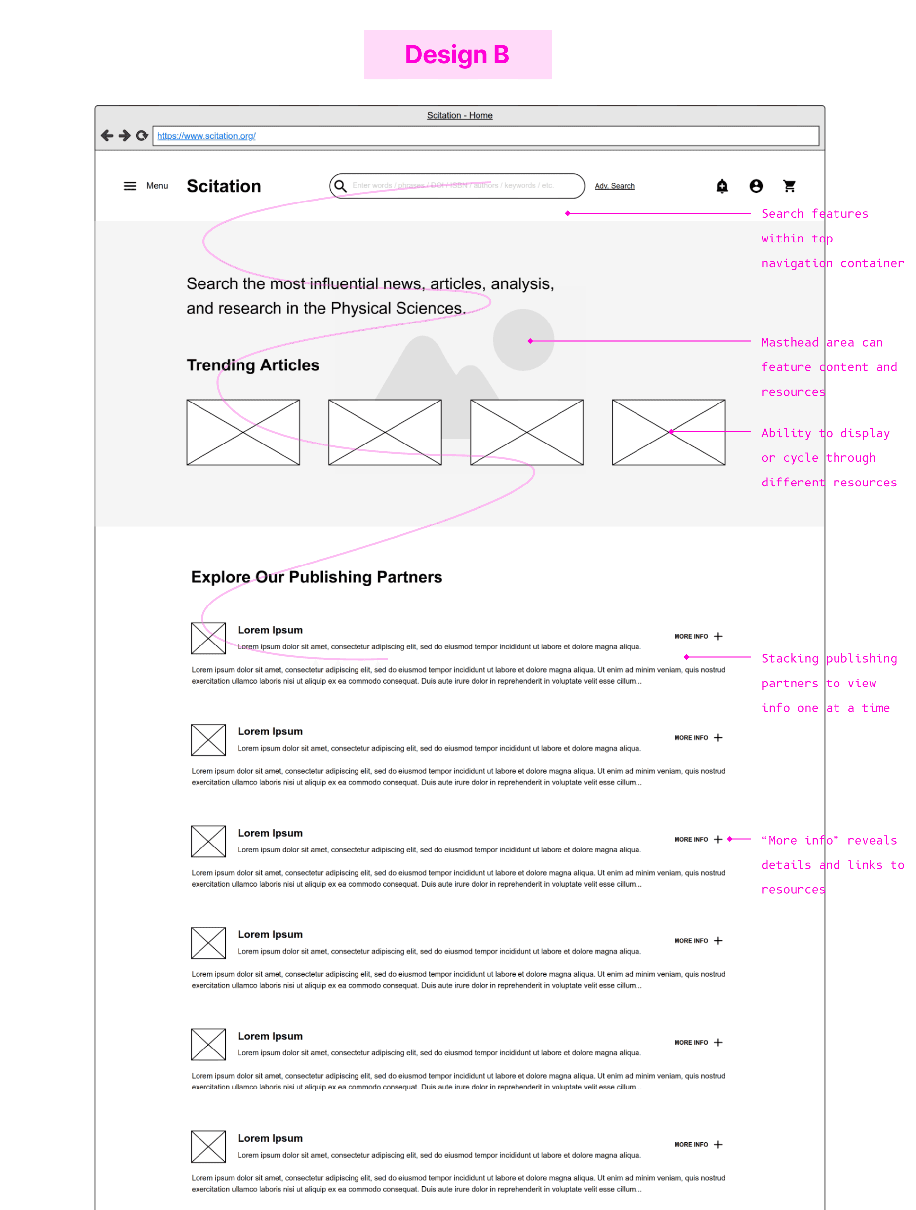
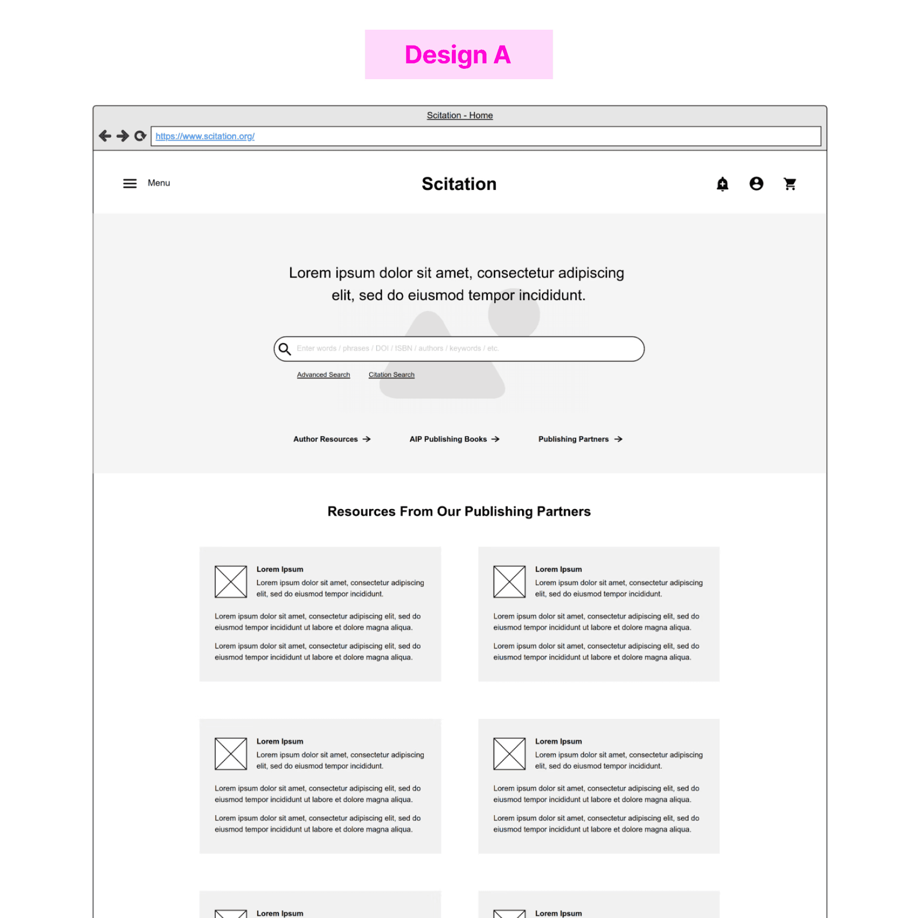
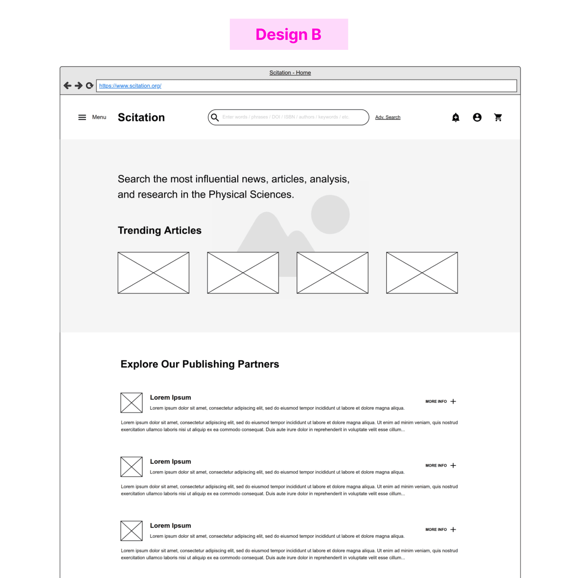
From my findings, I created two landing page designs that propose different solutions to features and search features and organization above and below the fold.
Stakeholder feedback
I was eager to test my redesign ideas, but I didn't have access to end-users. This meant missing out on insights that could influence my design direction.
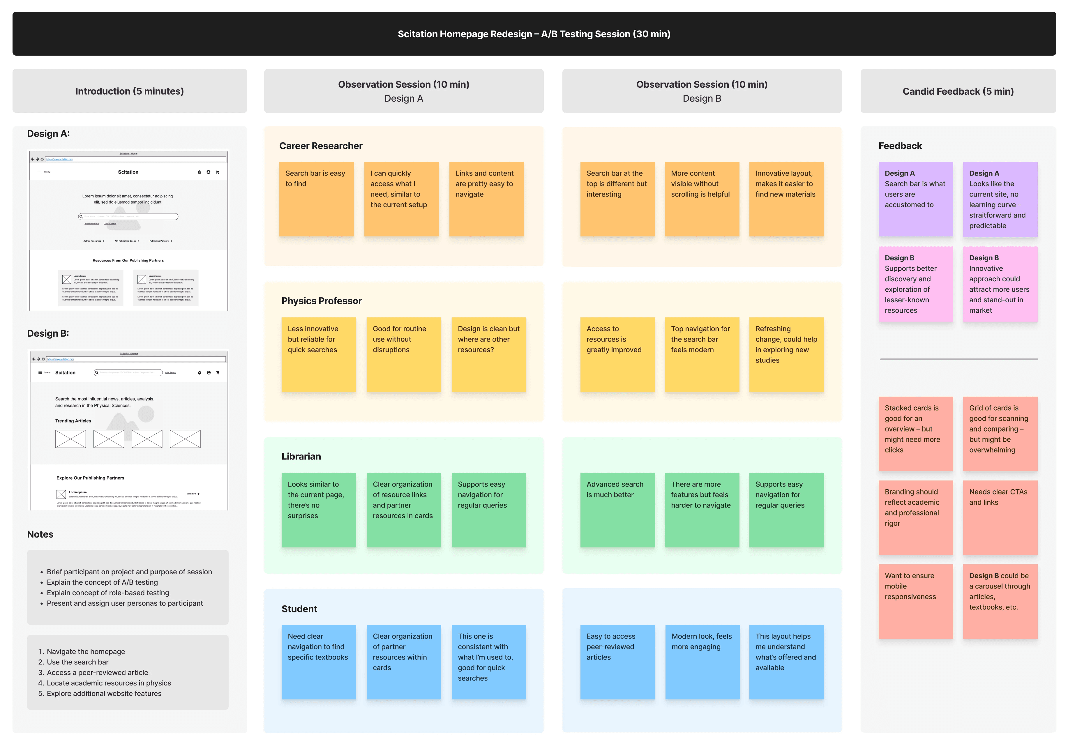
Being in a 3-month internship required a quick pivot, so I arranged sessions with Product and Marketing teammates to test my two designs using A/B testing and role-based feedback.
A/B Testing
Stakeholders navigated each design and shared feedback on usability and initial impressions.
Role-Based Feedback
Stakeholders assumed the role of an end-user and evaluated each design based on their needs.
Stakeholder Testing Board
Low-Fidelity Wireframes
Both versions were strong, but Design B promised to enhance resource discovery, user engagement, and market appeal.
Step 4 of 5 – Visual Design
Putting It All Together
1. Rebranded Design
I translated Design B into a high-fidelity design, focusing on my goal of creating a more engaging and rebranded experience.
High-Fidelity Preview
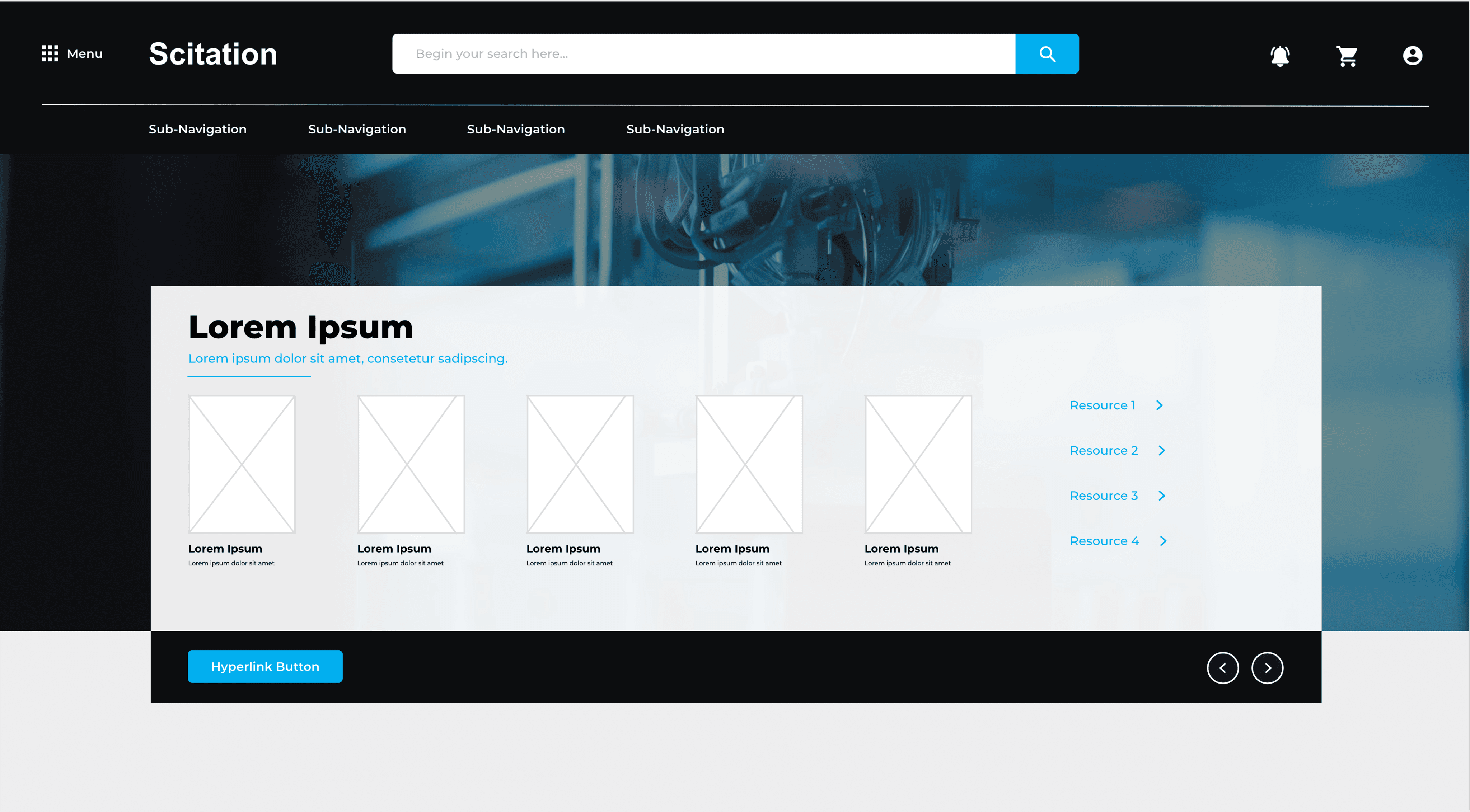
Search bar relocated to the top with other navigation, allowing for more space above the fold.
Card carousels through resources, providing access and discovery to lesser known products.
2. All-in-One Search
Given the popularity of the search bar, a primary focus was to enhance its functionality.
Previously, 'Advanced Search' and 'Citation Search' were separated across pages, disrupting the journey. I created an all-in-one search bar that brings these filters to the forefront.
Video Loop – Search Bar
Users can fine-tune their search, allowing for more precise, efficient search experiences.
Specific filters allows users to access more resources in the search database.
3. Simplified Information
A key component of the redesign was making information below the fold easier to use, as each Publishing Partner filled up the entire screen.
I researched ways to best present information-heavy content and adopted a card UI approach.
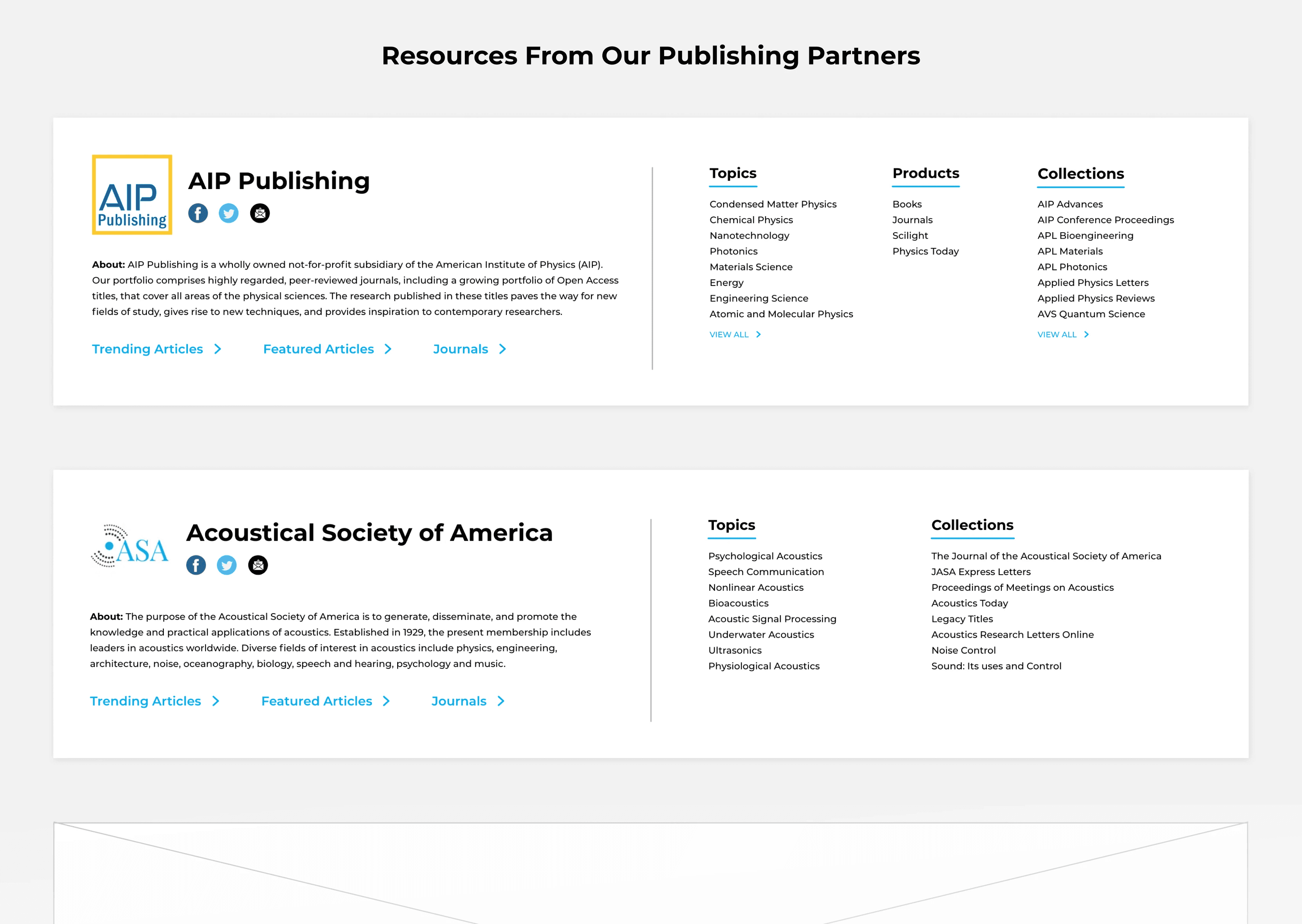
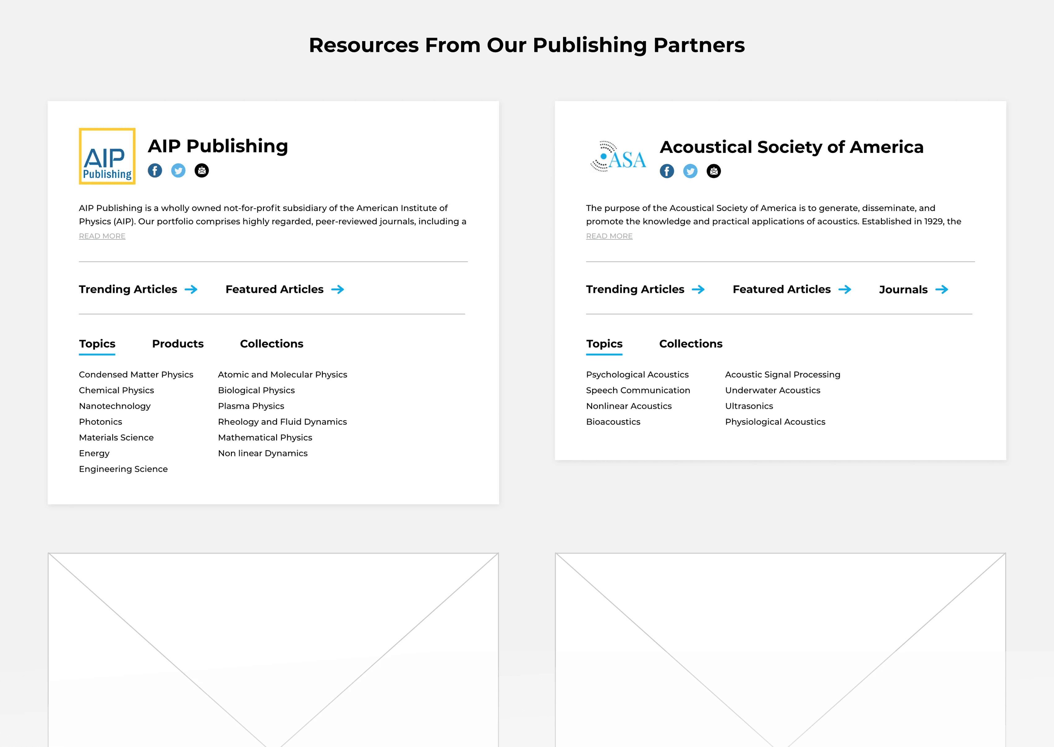
Stack vs Grid
Stacked layout allows space to showcase all resources within each partner.
Grid layout provides users with a visual way to compare different partners.
Step 5 of 5 – The Result
Wrapping Up
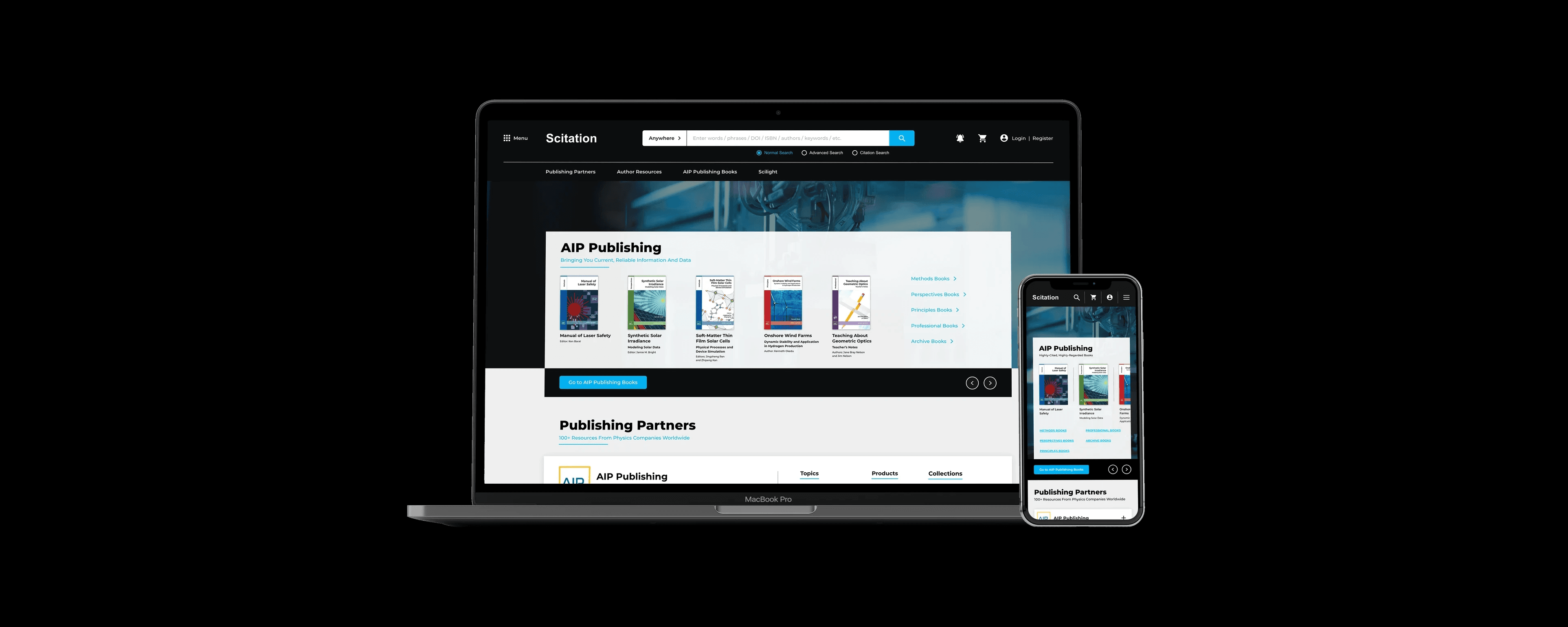
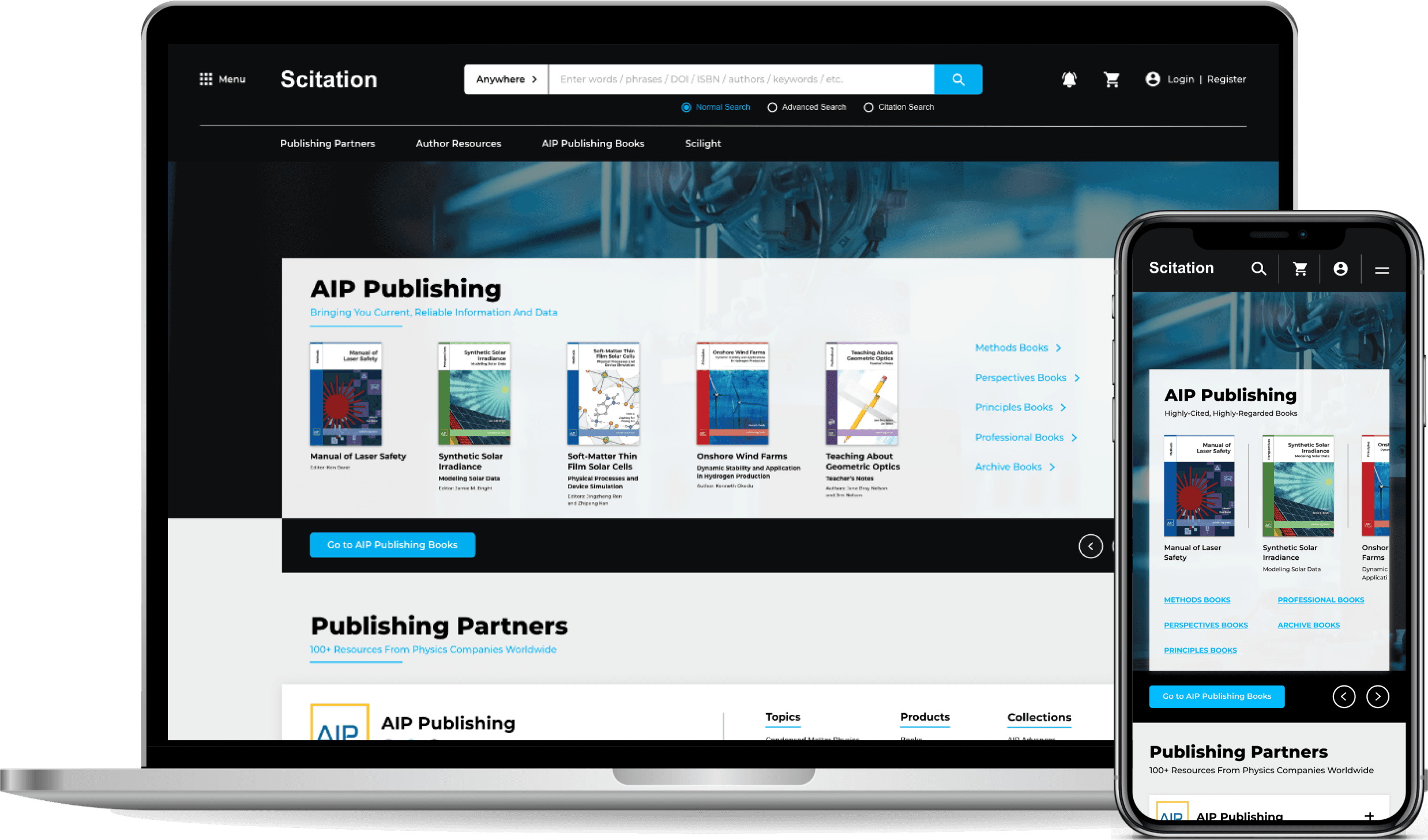
Desktop & Mobile Mockup
Presenting the prototype
At the end, I presented my project, research, and high-fidelity prototype to stakeholders in technology.
"My colleagues on the technology team were impressed with Hunter’s ideas and will move them to live production."
Robert Als, Web Development Lead
70% Decreased Length
Restructuring and redesigning information drastically reduced the landing page length compared to the original.
Success Metrics
Met goals of improving functionality, access to resources, and creating an updated experience.
