MoneyManager
My Role
Lead Product Designer
Timeline
Aug - Dec 2020, 4 months
Tools Used
Adobe XD
InVision
Miro
Overview
For my class project, I created a budgeting concept aimed at simplifying money management for young adults.
In my process, I interviewed students in the class, developed wireframes, and designed a high-fidelity prototype.
Step 1 of 5 – The Problem
Addressing Needs of a Specific Audience
Why a budgeting concept?
Based on personal experiences, I noticed college students frequently discuss financial insecurities and the lack of financial education in schools.
My goal was to design a money management tool that prioritizes simplicity and has a lower barrier-to-entry for students to start taking control of their personal finance.
How can we design a simple budgeting service that addresses the needs of users entering financial independence?
Identifying the problem:
1. Lack of Education
Schools lack personal finance courses, leaving students ill-prepared to manage their money.
2. Building Good Habits
Learning to manage their money now can help students make informed decisions and save for future expenses.
3. Complexity of Existing Tools
Existing budgeting apps and features can be overwhelming for students just starting to manage their finances.
Step 2 of 5 – The Research
Creating a Concept Foundation
What do students say?
Before diving into the design process, I conducted primary research by interviewing students in the class as my end-users.
I formulated three core problem statements from their responses on personal finance. This allowed me to better understand the audience and ensure design decisions are aligned with their needs.
"As a student, I want to start budgeting, but I'm clueless about where to start. It feels like a lot of work."
"I tend to spend a lot and wish there was an easy way to see where I'm going overboard – maybe then I could cut back and start good budgeting habits."
"As a young adult who was never taught financial literacy, I wish there was something simple that helps me see all my spending and finances in one place."
What's currently out there?
In addition to primary research, I conducted a review of current budgeting services in the market.
I analyzed their interface and features to compare what's most common as a basis for my concept and its needs.
Competitive Analysis
Step 3 of 5 – Info Architecture
Mapping the Experience
Concept features
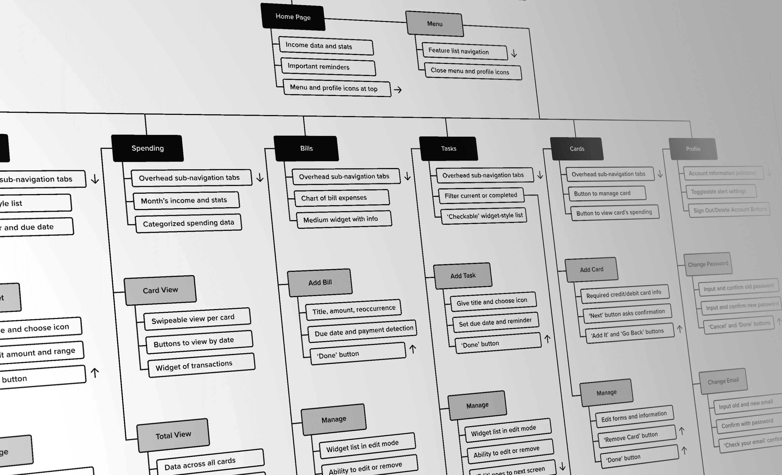
Following my research, I defined features with simplicity in mind. These included budgets, tasks, bills, and a spending overview.
One of my top priorities was automating as much as possible from the user's financial accounts. For example, spending amounts can be fed into the user's budgets, and recurring transactions can suggest bills to add.
Budgets
Create a budget by setting a category type, spending limit, and duration.
Spending
View cash flow, spending trends, top merchants, and recent transactions.
Recurring Bills
View upcoming payments from consistent account charges.
Feature Mapping
Starting in low-fidelity
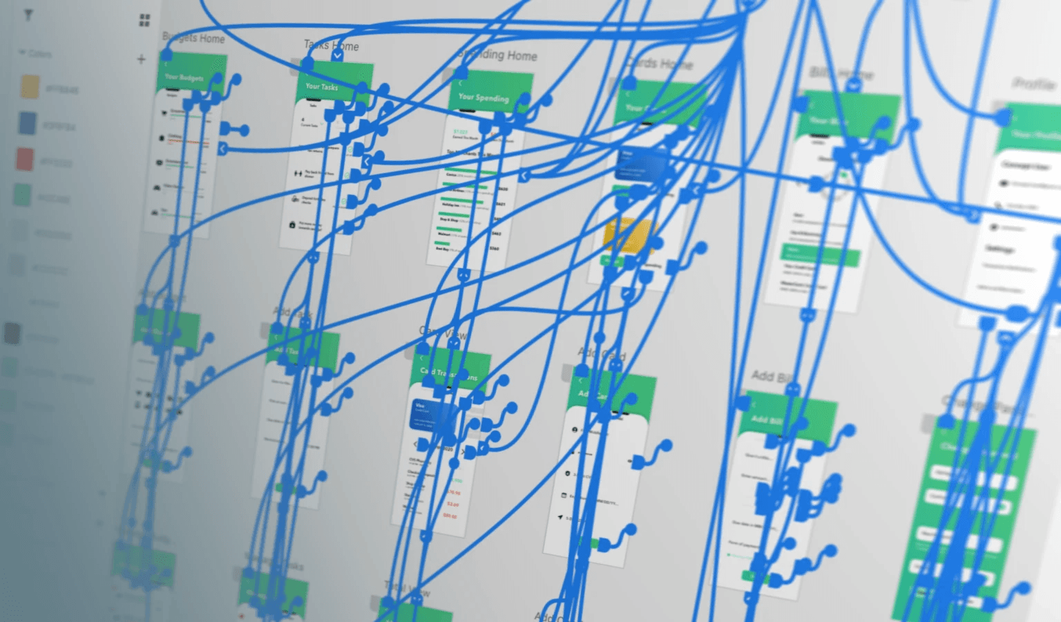
After identifying key features, I organized each screen and their information to show a navigation structure.
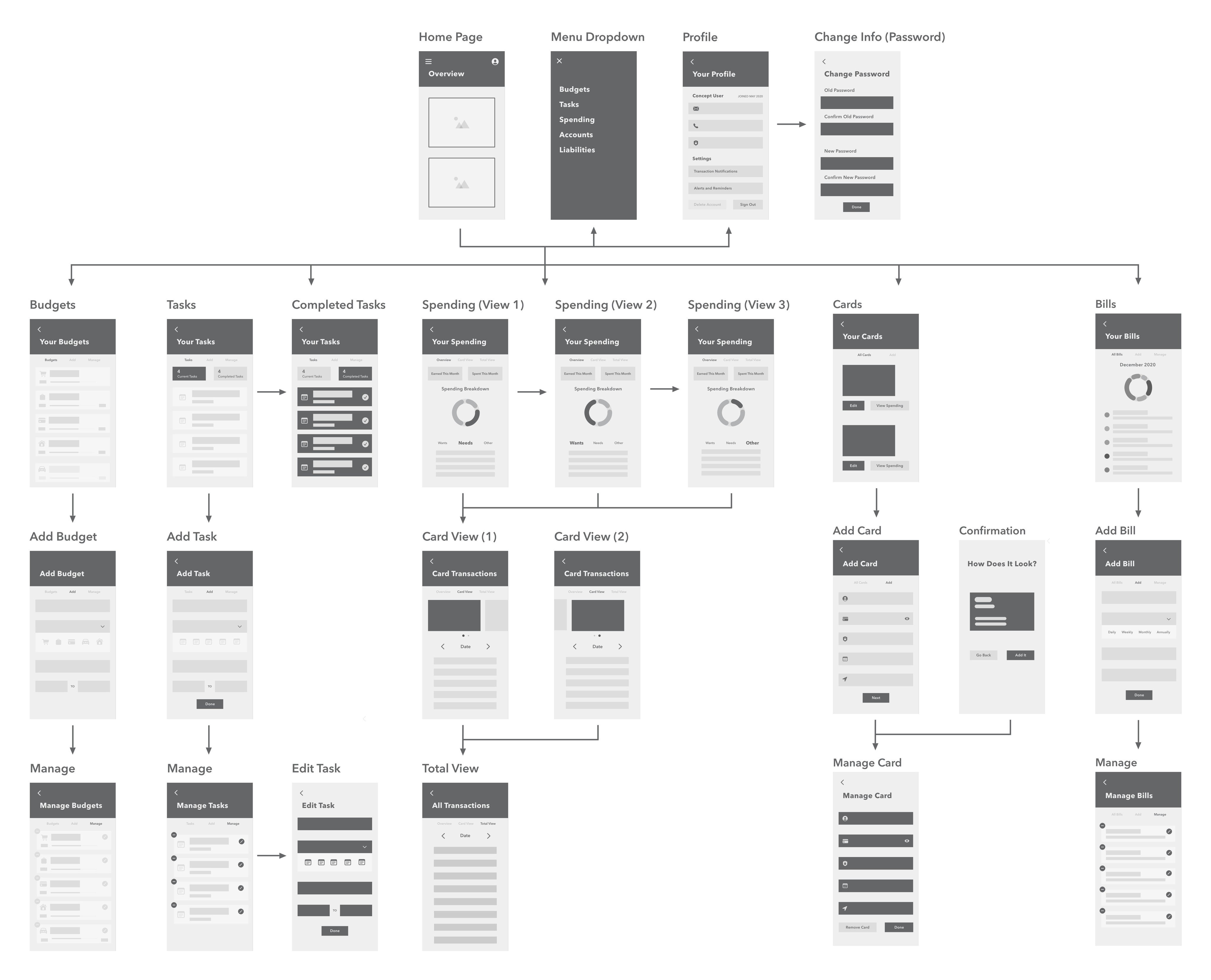
From there, I created low-fidelity wireframes for each screen to visualize and test my ideas with end-users.
Information Architecture
Low-Fidelity Wireframes
Step 4 of 5 – Usability Testing
Testing with End-Users
Design, test, repeat
I put together my low-fidelity screens in a prototype to test out my concept so far.
Over the course of a week, I met with 20 students and observed them as they performed tasks such as finding where to create a new budget, remove a debit card, and view spending across accounts.
Testing my low-fidelity prototype uncovered insights that drove design iteration in the high-fidelity design.
1. The Onboarding
Feedback
Users expressed confusion on the sign-in page about MoneyManager's purpose, offerings, and why they should use it over other services.
Solution
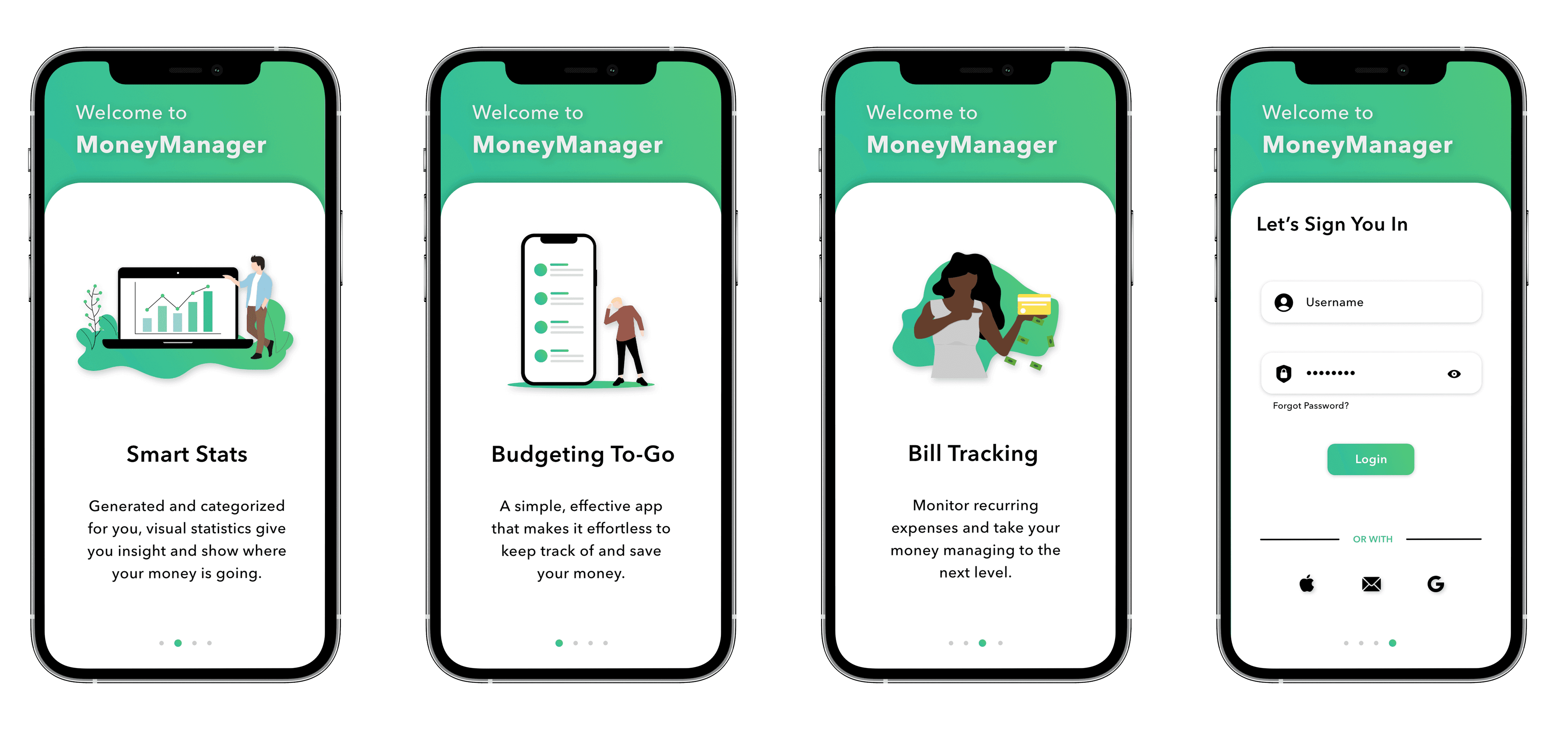
Based on this insight, I implemented an onboarding flow before the sign-in page to provide users with a clear understanding of the features and benefits.
2. A/B Testing Navigation
Feedback
Piloting both a bottom navigation bar and a drop-down menu with users revealed a preference in the drop-down to navigate to features.
Solution
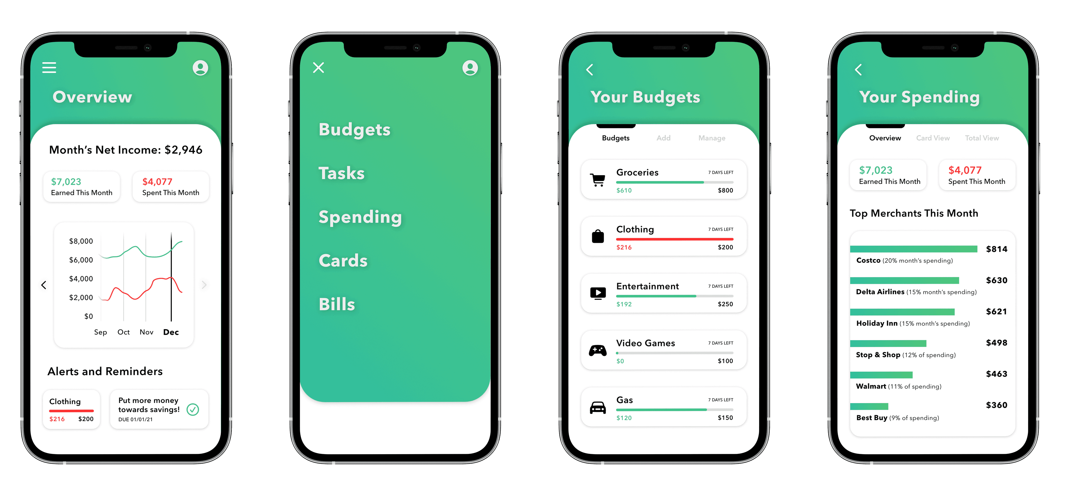
As a result, I integrated a hamburger menu at the top left of the home screen, offering users convenient access to pages and features.
3. Microinteractions
Feedback
Users encountered difficulty accessing previous transactions in their card transaction history, leading to frustration.
Solution
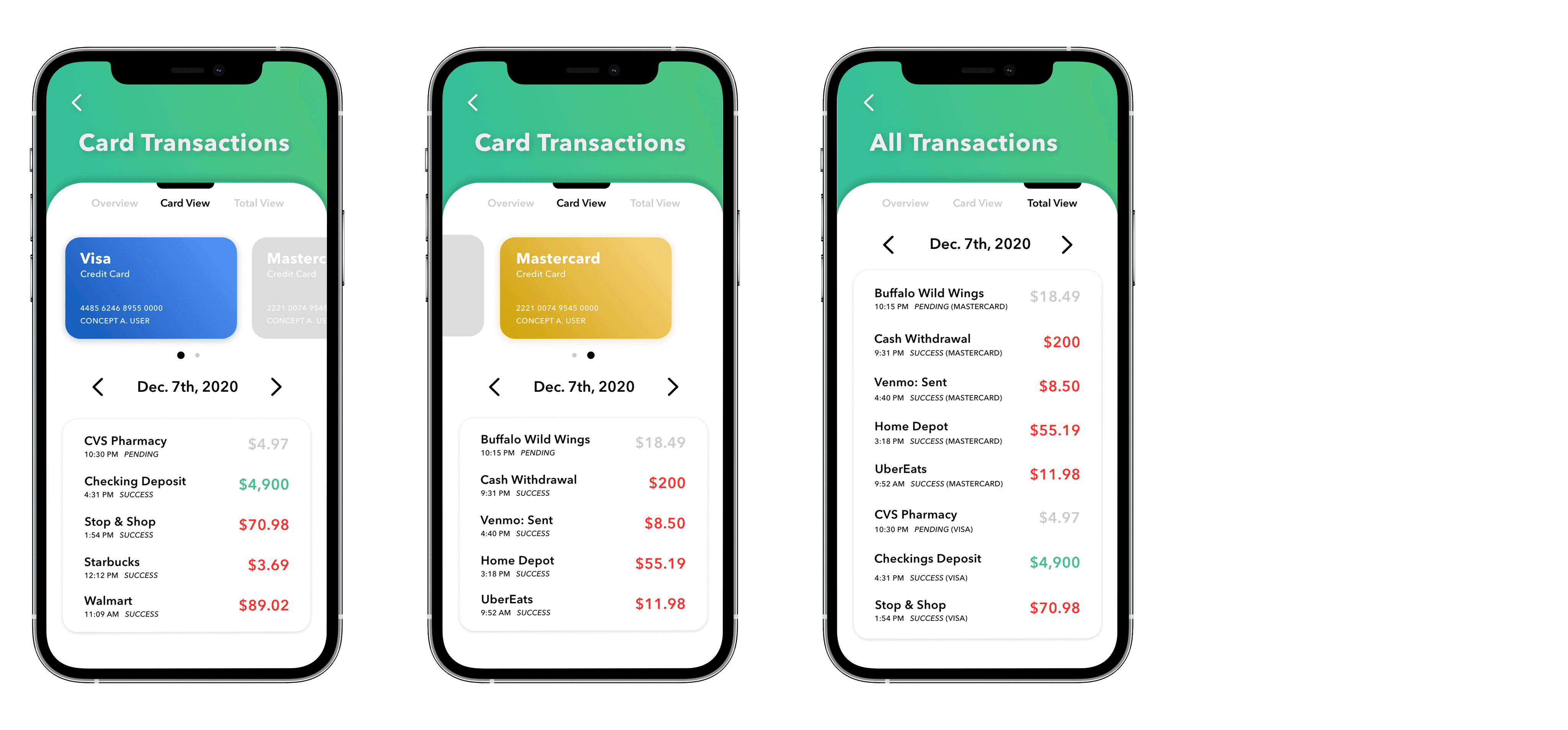
From this feedback, I introduced a component with a date selection and navigation arrows, allowing access to transactions from previous days.
Step 5 of 5 – High-Fidelity Design
Final Design and Prototype
Prototyping & Interactions
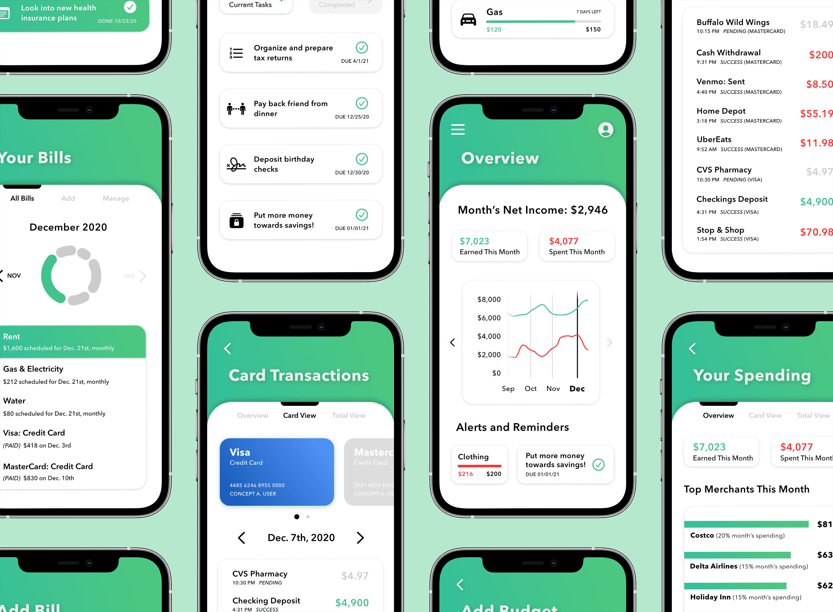
High-Fidelity Preview
Project Takeaways:
User Satisfaction
Walking through my final prototype with students resulted in resounding feedback and received best-in-class recognition.
Value of Early Feedback
Testing my low-fidelity design influenced my design direction and ensured the final solution was centered around user needs.


